matplotlib module
Visualization with Matplotlib
We’ll now take an in-depth look at the Matplotlib package for visualization in Python. Matplotlib is a multi-platform data visualization library built on NumPy arrays, and designed to work with the broader SciPy stack. It was conceived by John Hunter in 2002, originally as a patch to IPython for enabling interactive MATLAB-style plotting via gnuplot from the IPython command line. IPython’s creator, Fernando Perez, was at the time scrambling to finish his PhD, and let John know he wouldn’t have time to review the patch for several months. John took this as a cue to set out on his own, and the Matplotlib package was born, with version 0.1 released in 2003. It received an early boost when it was adopted as the plotting package of choice of the Space Telescope Science Institute (the folks behind the Hubble Telescope), which financially supported Matplotlib’s development and greatly expanded its capabilities.
One of Matplotlib’s most important features is its ability to play well with many operating systems and graphics backends. Matplotlib supports dozens of backends and output types, which means you can count on it to work regardless of which operating system you are using or which output format you wish. This cross-platform, everything-to-everyone approach has been one of the great strengths of Matplotlib. It has led to a large user base, which in turn has led to an active developer base and Matplotlib’s powerful tools and ubiquity within the scientific Python world.
In recent years, however, the interface and style of Matplotlib have begun to show their age. Newer tools like ggplot and ggvis in the R language, along with web visualization toolkits based on D3js and HTML5 canvas, often make Matplotlib feel clunky and old-fashioned. Still, I’m of the opinion that we cannot ignore Matplotlib’s strength as a well-tested, cross-platform graphics engine. Recent Matplotlib versions make it relatively easy to set new global plotting styles (see Customizing Matplotlib: Configurations and Style Sheets), and people have been developing new packages that build on its powerful internals to drive Matplotlib via cleaner, more modern APIs—for example, Seaborn (discussed in Visualization With Seaborn), ggpy, HoloViews, Altair, and even Pandas itself can be used as wrappers around Matplotlib’s API. Even with wrappers like these, it is still often useful to dive into Matplotlib’s syntax to adjust the final plot output. For this reason, I believe that Matplotlib itself will remain a vital piece of the data visualization stack, even if new tools mean the community gradually moves away from using the Matplotlib API directly.
Importing Matplotlib
Just as we use the np shorthand for NumPy and the pd shorthand
for Pandas, we will use some standard shorthands for Matplotlib imports:
import matplotlib as mpl
import matplotlib.pyplot as plt
Setting Styles
We will use the plt.style directive to choose appropriate aesthetic
styles for our figures. Here we will set the classic style, which
ensures that the plots we create use the classic Matplotlib style:
plt.style.use('classic')
Throughout this section, we will adjust this style as needed. Note that the stylesheets used here are supported as of Matplotlib version 1.5; if you are using an earlier version of Matplotlib, only the default style is available. For more information on stylesheets, see Customizing Matplotlib: Configurations and Style Sheets.
General Matplotlib Tips
Before we dive into the details of creating visualizations with Matplotlib, there are a few useful things you should know about using the package.
Plotting from an IPython notebook
The IPython notebook is a browser-based interactive data analysis tool that can combine narrative, code, graphics, HTML elements.
Plotting interactively within an IPython notebook can be done with the
%matplotlib command, and works in a similar way to the IPython
shell. In the IPython notebook, you also have the option of embedding
graphics directly in the notebook, with two possible options:
%matplotlib notebookwill lead to interactive plots embedded within the notebook%matplotlib inlinewill lead to static images of your plot embedded in the notebook
For this book, we will generally opt for %matplotlib inline:
%matplotlib inline
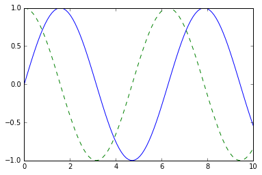
After running this command (it needs to be done only once per kernel/session), any cell within the notebook that creates a plot will embed a PNG image of the resulting graphic:
import numpy as np
x = np.linspace(0, 10, 100)

fig = plt.figure()
plt.plot(x, np.sin(x), '-')
plt.plot(x, np.cos(x), '--'); # pay attention to the last ";" to ignore the Line2D object
type(_[0])
matplotlib.lines.Line2D
Saving Figures to File
One nice feature of Matplotlib is the ability to save figures in a wide
variety of formats. Saving a figure can be done using the savefig()
command. For example, to save the previous figure as a PNG file, you can
run this:
fig.savefig('my_figure.png')
We now have a file called my_figure.png in the current working
directory:
!ls -lh my_figure.png
-rw-r--r-- 1 mn staff 26K Apr 8 12:10 my_figure.png
In savefig(), the file format is inferred from the extension of the
given filename. Depending on what backends you have installed, many
different file formats are available. The list of supported file types
can be found for your system by using the following method of the figure
canvas object:
fig.canvas.get_supported_filetypes()
{'eps': 'Encapsulated Postscript',
 'jpg': 'Joint Photographic Experts Group',
 'jpeg': 'Joint Photographic Experts Group',
 'pdf': 'Portable Document Format',
 'pgf': 'PGF code for LaTeX',
 'png': 'Portable Network Graphics',
 'ps': 'Postscript',
 'raw': 'Raw RGBA bitmap',
 'rgba': 'Raw RGBA bitmap',
 'svg': 'Scalable Vector Graphics',
 'svgz': 'Scalable Vector Graphics',
 'tif': 'Tagged Image File Format',
 'tiff': 'Tagged Image File Format'}
Two Interfaces for the Price of One
A potentially confusing feature of Matplotlib is its dual interfaces: a convenient MATLAB-style state-based interface, and a more powerful object-oriented interface. We’ll quickly highlight the differences between the two here.
MATLAB-style Interface
Matplotlib was originally written as a Python alternative for MATLAB
users, and much of its syntax reflects that fact. The MATLAB-style tools
are contained in the pyplot (plt) interface. For example, the
following code will probably look quite familiar to MATLAB users:
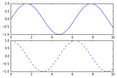
fig = plt.figure()  # create a plot figure

# create the first of two panels and set current axis
plt.subplot(2, 1, 1) # (rows, columns, panel number)
plt.plot(x, np.sin(x))

# create the second panel and set current axis
plt.subplot(2, 1, 2)
plt.plot(x, np.cos(x), '--');

Object-oriented interface
The object-oriented interface is available for these more complicated
situations, and for when you want more control over your figure. Rather
than depending on some notion of an “active” figure or axes, in the
object-oriented interface the plotting functions are methods of
explicit Figure and Axes objects. To re-create the previous plot
using this style of plotting, you might do the following:
# First create a grid of plots
# ax will be an array of two Axes objects
fig, ax = plt.subplots(2)

# Call plot() method on the appropriate object
ax[0].plot(x, np.sin(x))
ax[1].plot(x, np.cos(x), '--');
Simple Line Plots
Perhaps the simplest of all plots is the visualization of a single function \(y = f(x)\). Here we will take a first look at creating a simple plot of this type. As with all the following sections, we’ll start by setting up the notebook for plotting and importing the packages we will use:
%matplotlib inline
import matplotlib.pyplot as plt
plt.style.use('seaborn-whitegrid')
import numpy as np
For all Matplotlib plots, we start by creating a figure and an axes. In their simplest form, a figure and axes can be created as follows:
fig = plt.figure()
ax = plt.axes()
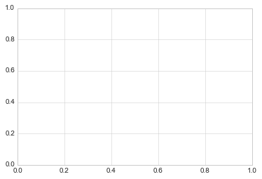
In Matplotlib, the figure (an instance of the class plt.Figure)
can be thought of as a single container that contains all the objects
representing axes, graphics, text, and labels. The axes (an instance
of the class plt.Axes) is what we see above: a bounding box with
ticks and labels, which will eventually contain the plot elements that
make up our visualization. Throughout this book, we’ll commonly use the
variable name fig to refer to a figure instance, and ax to refer
to an axes instance or group of axes instances.
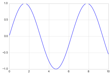
Once we have created an axes, we can use the ax.plot function to
plot some data. Let’s start with a simple sinusoid:
fig = plt.figure()
ax = plt.axes()

x = np.linspace(0, 10, 1000)
ax.plot(x, np.sin(x));

Alternatively, we can use the pylab interface and let the figure and axes be created for us in the background:
plt.plot(x, np.sin(x));
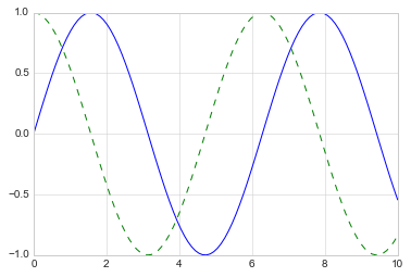
If we want to create a single figure with multiple lines, we can simply
call the plot function multiple times:
plt.plot(x, np.sin(x))
plt.plot(x, np.cos(x), '--');
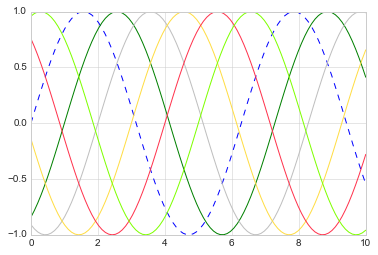
The first adjustment you might wish to make to a plot is to control the
line colors and styles. The plt.plot() function takes additional
arguments that can be used to specify these. To adjust the color, you
can use the color keyword, which accepts a string argument
representing virtually any imaginable color.
The color can be specified in a variety of ways (If no color is specified, Matplotlib will automatically cycle through a set of default colors for multiple lines):
plt.plot(x, np.sin(x - 0), '--', color='blue')        # specify color by name
plt.plot(x, np.sin(x - 1), color='g')           # short color code (rgbcmyk)
plt.plot(x, np.sin(x - 2), color='0.75')        # Grayscale between 0 and 1
plt.plot(x, np.sin(x - 3), color='#FFDD44')     # Hex code (RRGGBB from 00 to FF)
plt.plot(x, np.sin(x - 4), color=(1.0,0.2,0.3)) # RGB tuple, values 0 to 1
plt.plot(x, np.sin(x - 5), color='chartreuse'); # all HTML color names supported
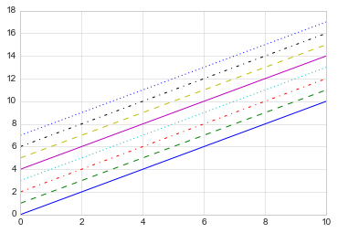
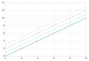
Similarly, the line style can be adjusted using the linestyle
keyword:
plt.plot(x, x + 0, linestyle='solid')
plt.plot(x, x + 1, linestyle='dashed') # '--'
plt.plot(x, x + 2, linestyle='dashdot')
plt.plot(x, x + 3, linestyle='dotted');

# For short, you can use the following codes:
plt.plot(x, x + 4, linestyle='-')  # solid
plt.plot(x, x + 5, linestyle='--') # dashed
plt.plot(x, x + 6, linestyle='-.') # dashdot
plt.plot(x, x + 7, linestyle=':');  # dotted
If you would like to be extremely terse, these linestyle and
color codes can be combined into a single non-keyword argument to
the plt.plot() function:
plt.plot(x, x + 0, '-g')  # solid green
plt.plot(x, x + 1, '--c') # dashed cyan
plt.plot(x, x + 2, '-.k') # dashdot black
plt.plot(x, x + 3, ':r');  # dotted red
import this
The Zen of Python, by Tim Peters

Beautiful is better than ugly.
Explicit is better than implicit.
Simple is better than complex.
Complex is better than complicated.
Flat is better than nested.
Sparse is better than dense.
Readability counts.
Special cases aren't special enough to break the rules.
Although practicality beats purity.
Errors should never pass silently.
Unless explicitly silenced.
In the face of ambiguity, refuse the temptation to guess.
There should be one-- and preferably only one --obvious way to do it.
Although that way may not be obvious at first unless you're Dutch.
Now is better than never.
Although never is often better than right now.
If the implementation is hard to explain, it's a bad idea.
If the implementation is easy to explain, it may be a good idea.
Namespaces are one honking great idea -- let's do more of those!
Matplotlib does a decent job of choosing default axes limits for your
plot, but sometimes it’s nice to have finer control. The most basic way
to adjust axis limits is to use the plt.xlim() and plt.ylim()
methods:
plt.plot(x, np.sin(x))

plt.xlim(-1, 11)
plt.ylim(-1.5, 1.5);

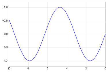
If for some reason you’d like either axis to be displayed in reverse, you can simply reverse the order of the arguments:
plt.plot(x, np.sin(x))

plt.xlim(10, 0)
plt.ylim(1.2, -1.2);
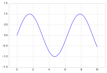
A useful related method is plt.axis() (note here the potential
confusion between axes with an e, and axis with an i). The
plt.axis() method allows you to set the x and y limits with
a single call, by passing a list which specifies
[xmin, xmax, ymin, ymax]:
plt.plot(x, np.sin(x))
plt.axis([-1, 11, -1.5, 1.5]);
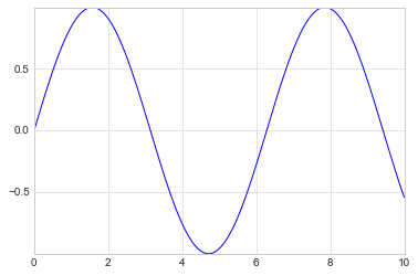
The plt.axis() method goes even beyond this, allowing you to do
things like automatically tighten the bounds around the current plot:
plt.plot(x, np.sin(x))
plt.axis('tight');
It allows even higher-level specifications, such as ensuring an equal
aspect ratio so that on your screen, one unit in x is equal to one
unit in y:
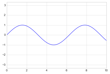
plt.plot(x, np.sin(x))
plt.axis('equal');
As the last piece of this section, we’ll briefly look at the labeling of plots: titles, axis labels, and simple legends.
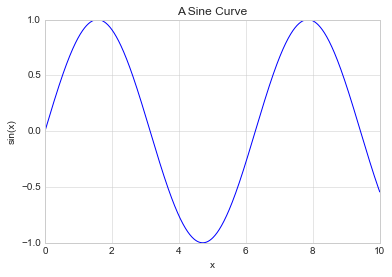
Titles and axis labels are the simplest such labels—there are methods that can be used to quickly set them:
plt.plot(x, np.sin(x))
plt.title("A Sine Curve")
plt.xlabel("x")
plt.ylabel("sin(x)");
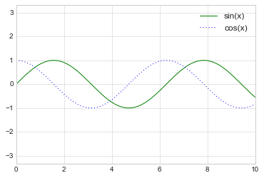
When multiple lines are being shown within a single axes, it can be
useful to create a plot legend that labels each line type. Again,
Matplotlib has a built-in way of quickly creating such a legend. It is
done via the (you guessed it) plt.legend() method. Though there are
several valid ways of using this, I find it easiest to specify the label
of each line using the label keyword of the plot function:
plt.plot(x, np.sin(x), '-g', label='sin(x)')
plt.plot(x, np.cos(x), ':b', label='cos(x)')
plt.axis('equal')

plt.legend();
While most plt functions translate directly to ax methods (such
as plt.plot() → ax.plot(), plt.legend() → ax.legend(),
etc.), this is not the case for all commands. In particular, functions
to set limits, labels, and titles are slightly modified. For
transitioning between MATLAB-style functions and object-oriented
methods, make the following changes:
plt.xlabel()→ax.set_xlabel()plt.ylabel()→ax.set_ylabel()plt.xlim()→ax.set_xlim()plt.ylim()→ax.set_ylim()plt.title()→ax.set_title()
In the object-oriented interface to plotting, rather than calling these
functions individually, it is often more convenient to use the
ax.set() method to set all these properties at once:
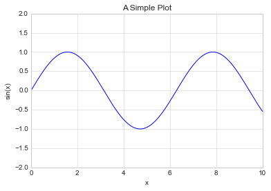
ax = plt.axes()
ax.plot(x, np.sin(x))
ax.set(xlim=(0, 10), ylim=(-2, 2), xlabel='x', ylabel='sin(x)', title='A Simple Plot'); # focus on metadata only
Simple Scatter Plots
Another commonly used plot type is the simple scatter plot, a close cousin of the line plot. Instead of points being joined by line segments, here the points are represented individually with a dot, circle, or other shape. We’ll start by setting up the notebook for plotting and importing the functions we will use:
%matplotlib inline
import matplotlib.pyplot as plt
plt.style.use('seaborn-whitegrid')
import numpy as np
In the previous section we looked at plt.plot/ax.plot to produce
line plots. It turns out that this same function can produce scatter
plots as well:
x = np.linspace(0, 10, 30)
y = np.sin(x)

plt.plot(x, y, 'o', color='black');
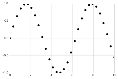
The third argument in the function call is a character that represents
the type of symbol used for the plotting. Just as you can specify
options such as '-', '--' to control the line style, the marker
style has its own set of short string codes. The full list of available
symbols can be seen in the documentation of plt.plot, or in
Matplotlib’s online documentation. Most of the possibilities are fairly
intuitive, and we’ll show a number of the more common ones here:
rng = np.random.RandomState(0)
for marker in ['o', '.', ',', 'x', '+', 'v', '^', '<', '>', 's', 'd']:
    plt.plot(rng.rand(5), rng.rand(5), marker, label="marker='{0}'".format(marker))
plt.legend(numpoints=1)
plt.xlim(0, 1.8);
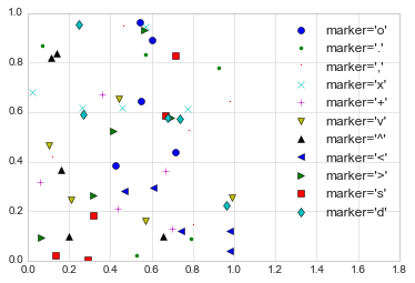
For even more possibilities, these character codes can be used together with line and color codes to plot points along with a line connecting them:
plt.plot(x, y, '-ok');
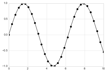
Additional keyword arguments to plt.plot specify a wide range of
properties of the lines and markers:
plt.plot(x, y, '-p', color='gray',
         markersize=15, linewidth=4,
         markerfacecolor='white',
         markeredgecolor='gray',
         markeredgewidth=2)
plt.ylim(-1.2, 1.2);
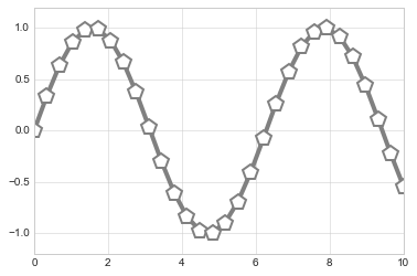
A second, more powerful method of creating scatter plots is the
plt.scatter function, which can be used very similarly to the
plt.plot function:
plt.scatter(x, y, marker='o');
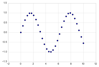
The primary difference of plt.scatter from plt.plot is that it
can be used to create scatter plots where the properties of each
individual point (size, face color, edge color, etc.) can be
individually controlled or mapped to data.
Let’s show this by creating a random scatter plot with points of many
colors and sizes. In order to better see the overlapping results, we’ll
also use the alpha keyword to adjust the transparency level:
rng = np.random.RandomState(0)
x = rng.randn(100)
y = rng.randn(100)
colors = rng.rand(100)
sizes = 1000 * rng.rand(100)

plt.scatter(x, y, c=colors, s=sizes, alpha=0.3, cmap='viridis')
plt.colorbar();  # show color scale. In parallel with `plt.legend()`
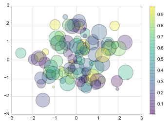
Notice that the color argument is automatically mapped to a color scale
(shown here by the colorbar() command), and that the size argument
is given in pixels. In this way, the color and size of points can be
used to convey information in the visualization, in order to visualize
multidimensional data.
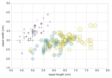
For example, we might use the Iris data from Scikit-Learn, where each sample is one of three types of flowers that has had the size of its petals and sepals carefully measured:
from sklearn.datasets import load_iris
iris = load_iris()
features = iris.data.T

plt.scatter(features[0], features[1], alpha=0.2, s=100*features[3], c=iris.target, cmap='viridis')
plt.xlabel(iris.feature_names[0])
plt.ylabel(iris.feature_names[1]);
Aside from the different features available in plt.plot and
plt.scatter, why might you choose to use one over the other? While
it doesn’t matter as much for small amounts of data, as datasets get
larger than a few thousand points, plt.plot can be noticeably more
efficient than plt.scatter. The reason is that plt.scatter has
the capability to render a different size and/or color for each point,
so the renderer must do the extra work of constructing each point
individually. In plt.plot, on the other hand, the points are always
essentially clones of each other, so the work of determining the
appearance of the points is done only once for the entire set of data.
For large datasets, the difference between these two can lead to vastly
different performance, and for this reason, plt.plot should be
preferred over plt.scatter for large datasets.
Visualizing Errors
For any scientific measurement, accurate accounting for errors is nearly as important, if not more important, than accurate reporting of the number itself. For example, imagine that I am using some astrophysical observations to estimate the Hubble Constant, the local measurement of the expansion rate of the Universe. I know that the current literature suggests a value of around 71 (km/s)/Mpc, and I measure a value of 74 (km/s)/Mpc with my method. Are the values consistent? The only correct answer, given this information, is this: there is no way to know.
Suppose I augment this information with reported uncertainties: the current literature suggests a value of around 71 \(\pm\) 2.5 (km/s)/Mpc, and my method has measured a value of 74 \(\pm\) 5 (km/s)/Mpc. Now are the values consistent? That is a question that can be quantitatively answered.
In visualization of data and results, showing these errors effectively can make a plot convey much more complete information.
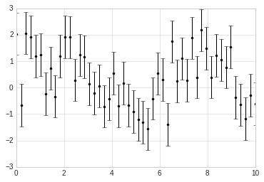
A basic errorbar can be created with a single Matplotlib function call:
%matplotlib inline
import matplotlib.pyplot as plt
plt.style.use('seaborn-whitegrid')
import numpy as np
Here the fmt is a format code controlling the appearance of lines
and points, and has the same syntax as the shorthand used in
plt.plot.
x = np.linspace(0, 10, 50)
dy = 0.8
y = np.sin(x) + dy * np.random.randn(50)

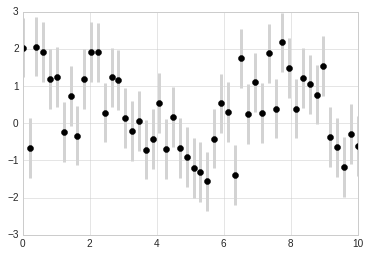
plt.errorbar(x, y, yerr=dy, fmt='.k');
In addition to these basic options, the errorbar function has many
options to fine-tune the outputs. Using these additional options you can
easily customize the aesthetics of your errorbar plot. I often find it
helpful, especially in crowded plots, to make the errorbars lighter than
the points themselves:
plt.errorbar(x, y, yerr=dy, fmt='o', color='black', ecolor='lightgray', elinewidth=3, capsize=0);
Density and Contour Plots
Sometimes it is useful to display three-dimensional data in two
dimensions using contours or color-coded regions. There are three
Matplotlib functions that can be helpful for this task: plt.contour
for contour plots, plt.contourf for filled contour plots, and
plt.imshow for showing images. This section looks at several
examples of using these. We’ll start by setting up the notebook for
plotting and importing the functions we will use:
%matplotlib inline
import matplotlib.pyplot as plt
plt.style.use('seaborn-white')
import numpy as np
We’ll start by demonstrating a contour plot using a function \(z = f(x, y)\), using the following particular choice for \(f\) (we’ve seen this before in Computation on Arrays: Broadcasting, when we used it as a motivating example for array broadcasting):
def f(x, y):
    return np.sin(x) ** 10 + np.cos(10 + y * x) * np.cos(x)
A contour plot can be created with the plt.contour function. It
takes three arguments: a grid of x values, a grid of y values, and a
grid of z values. The x and y values represent positions on the
plot, and the z values will be represented by the contour levels.
Perhaps the most straightforward way to prepare such data is to use the
np.meshgrid function, which builds two-dimensional grids from
one-dimensional arrays:
x = np.linspace(0, 5, 50)
y = np.linspace(0, 5, 40)

X, Y = np.meshgrid(x, y)
Z = f(X, Y)
Now let’s look at this with a standard line-only contour plot:
plt.contour(X, Y, Z, colors='black');
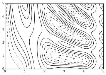
Notice that by default when a single color is used, negative values are represented by dashed lines, and positive values by solid lines.
Alternatively, the lines can be color-coded by specifying a colormap
with the cmap argument. Here, we’ll also specify that we want more
lines to be drawn—20 equally spaced intervals within the data range:
plt.contour(X, Y, Z, 20, cmap='RdGy');
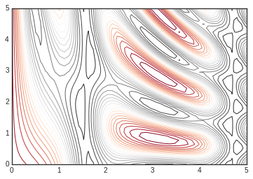
Here we chose the RdGy (short for Red-Gray) colormap, which is a
good choice for centered data. Matplotlib has a wide range of colormaps
available, which you can easily browse in IPython by doing a tab
completion on the plt.cm module:
plt.cm.<TAB>
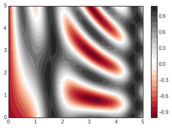
Our plot is looking nicer, but the spaces between the lines may be a bit
distracting. We can change this by switching to a filled contour plot
using the plt.contourf() function (notice the f at the end),
which uses largely the same syntax as plt.contour().
Additionally, we’ll add a plt.colorbar() command, which
automatically creates an additional axis with labeled color information
for the plot:
plt.contourf(X, Y, Z, 20, cmap='RdGy')
plt.colorbar(); # The colorbar makes it clear that the black regions
                # are "peaks," while the red regions are "valleys."
One potential issue with this plot is that it is a bit “splotchy.” That
is, the color steps are discrete rather than continuous, which is not
always what is desired. This could be remedied by setting the number of
contours to a very high number, but this results in a rather inefficient
plot: Matplotlib must render a new polygon for each step in the level. A
better way to handle this is to use the plt.imshow() function, which
interprets a two-dimensional grid of data as an image. The following
code shows this:
plt.imshow(Z, extent=[0, 5, 0, 5], origin='lower', cmap='RdGy')
plt.colorbar()
plt.axis(aspect='image');
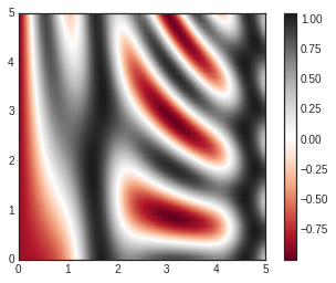
There are a few potential gotchas with imshow(), however:
plt.imshow()doesn’t accept an x and y grid, so you must manually specify the extent [xmin, xmax, ymin, ymax] of the image on the plot.plt.imshow()by default follows the standard image array definition where the origin is in the upper left, not in the lower left as in most contour plots. This must be changed when showing gridded data.plt.imshow()will automatically adjust the axis aspect ratio to match the input data; this can be changed by setting, for example,plt.axis(aspect='image')to make x and y units match.
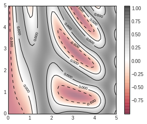
Finally, it can sometimes be useful to combine contour plots and image
plots. For example, here we’ll use a partially transparent background
image (with transparency set via the alpha parameter) and overplot
contours with labels on the contours themselves (using the
plt.clabel() function):
contours = plt.contour(X, Y, Z, 3, colors='black')
plt.clabel(contours, inline=True, fontsize=8)

plt.imshow(Z, extent=[0, 5, 0, 5], origin='lower', cmap='RdGy', alpha=0.5)
plt.colorbar();
Histograms, Binnings, and Density
A simple histogram can be a great first step in understanding a dataset. Earlier, we saw a preview of Matplotlib’s histogram function (see Comparisons, Masks, and Boolean Logic), which creates a basic histogram in one line, once the normal boiler-plate imports are done:
%matplotlib inline
import numpy as np
import matplotlib.pyplot as plt
plt.style.use('seaborn-white')
data = np.random.randn(1000)
plt.hist(data);
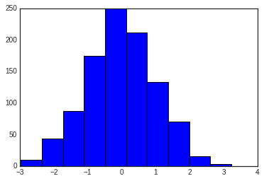
The hist() function has many options to tune both the calculation
and the display; here’s an example of a more customized histogram:
plt.hist(data, bins=30, density=True, alpha=0.5,
         histtype='stepfilled', color='steelblue',
         edgecolor='none');
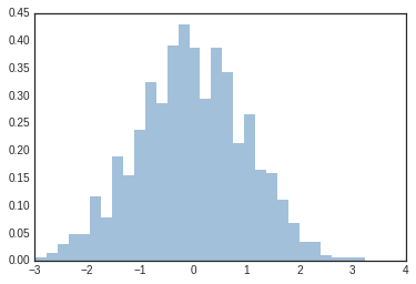
The plt.hist docstring has more information on other customization
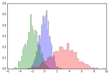
options available. I find this combination of histtype='stepfilled'
along with some transparency alpha to be very useful when comparing
histograms of several distributions:
x1 = np.random.normal(0, 0.8, 1000)
x2 = np.random.normal(-2, 1, 1000)
x3 = np.random.normal(3, 2, 1000)

kwargs = dict(histtype='stepfilled', alpha=0.3, density=True, bins=40)

plt.hist(x1, **kwargs)
plt.hist(x2, **kwargs)
plt.hist(x3, **kwargs);
If you would like to simply compute the histogram (that is, count the
number of points in a given bin) and not display it, the
np.histogram() function is available:
counts, bin_edges = np.histogram(data, bins=5)
print(counts)
[ 54 262 462 203 19]
Just as we create histograms in one dimension by dividing the
number-line into bins, we can also create histograms in two-dimensions
by dividing points among two-dimensional bins. We’ll take a brief look
at several ways to do this here. We’ll start by defining some data—an
x and y array drawn from a multivariate Gaussian distribution:
mean = [0, 0]
cov = [[1, 1], [1, 2]]
x, y = np.random.multivariate_normal(mean, cov, 10000).T
plt.hist2d: Two-dimensional histogram
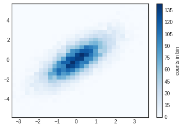
One straightforward way to plot a two-dimensional histogram is to use
Matplotlib’s plt.hist2d function:
plt.hist2d(x, y, bins=30, cmap='Blues')
cb = plt.colorbar()
cb.set_label('counts in bin')
Just as with plt.hist, plt.hist2d has a number of extra options
to fine-tune the plot and the binning, which are nicely outlined in the
function docstring. Further, just as plt.hist has a counterpart in
np.histogram, plt.hist2d has a counterpart in
np.histogram2d, which can be used as follows:
counts, xedges, yedges = np.histogram2d(x, y, bins=30)
plt.hexbin: Hexagonal binnings
The two-dimensional histogram creates a tesselation of squares across
the axes. Another natural shape for such a tesselation is the regular
hexagon. For this purpose, Matplotlib provides the plt.hexbin
routine, which will represents a two-dimensional dataset binned within a
grid of hexagons:
plt.hexbin(x, y, gridsize=30, cmap='Blues')
cb = plt.colorbar(label='count in bin')

plt.hexbin has a number of interesting options, including the
ability to specify weights for each point, and to change the output in
each bin to any NumPy aggregate (mean of weights, standard deviation of
weights, etc.).
Kernel density estimation
Another common method of evaluating densities in multiple dimensions is
kernel density estimation (KDE). This will be discussed more fully in
In-Depth: Kernel Density
Estimation, but for now we’ll
simply mention that KDE can be thought of as a way to “smear out” the
points in space and add up the result to obtain a smooth function. One
extremely quick and simple KDE implementation exists in the
scipy.stats package. Here is a quick example of using the KDE on
this data:
from scipy.stats import gaussian_kde

# fit an array of size [Ndim, Nsamples]
data = np.vstack([x, y])
kde = gaussian_kde(data)

# evaluate on a regular grid
xgrid = np.linspace(-3.5, 3.5, 40)
ygrid = np.linspace(-6, 6, 40)
Xgrid, Ygrid = np.meshgrid(xgrid, ygrid)
Z = kde.evaluate(np.vstack([Xgrid.ravel(), Ygrid.ravel()]))

# Plot the result as an image
plt.imshow(Z.reshape(Xgrid.shape), origin='lower', aspect='auto', extent=[-3.5, 3.5, -6, 6], cmap='Blues')
cb = plt.colorbar()
cb.set_label("density")
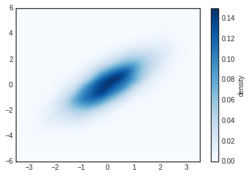
KDE has a smoothing length that effectively slides the knob between
detail and smoothness (one example of the ubiquitous bias–variance
trade-off). The literature on choosing an appropriate smoothing length
is vast: gaussian_kde uses a rule-of-thumb to attempt to find a
nearly optimal smoothing length for the input data.
Other KDE implementations are available within the SciPy ecosystem, each
with its own strengths and weaknesses; see, for example,
sklearn.neighbors.KernelDensity and
statsmodels.nonparametric.kernel_density.KDEMultivariate.
Customizing Plot Legends
Plot legends give meaning to a visualization, assigning meaning to the various plot elements. We previously saw how to create a simple legend; here we’ll take a look at customizing the placement and aesthetics of the legend in Matplotlib.
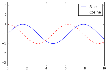
The simplest legend can be created with the plt.legend() command,
which automatically creates a legend for any labeled plot elements:
import matplotlib.pyplot as plt
plt.style.use('classic')
%matplotlib inline
import numpy as np
x = np.linspace(0, 10, 1000)
fig, ax = plt.subplots()
ax.plot(x, np.sin(x), '-b', label='Sine')
ax.plot(x, np.cos(x), '--r', label='Cosine')
ax.axis('equal')
leg = ax.legend();
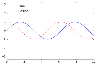
But there are many ways we might want to customize such a legend. For example, we can specify the location and turn off the frame:
ax.legend(loc='upper left', frameon=False)
fig
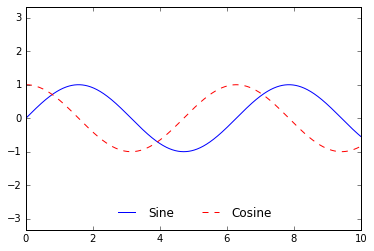
We can use the ncol command to specify the number of columns in the
legend:
ax.legend(frameon=False, loc='lower center', ncol=2)
fig
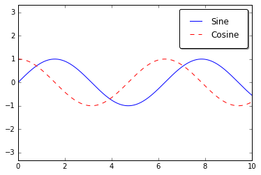
We can use a rounded box (fancybox) or add a shadow, change the
transparency (alpha value) of the frame, or change the padding around
the text:
ax.legend(fancybox=True, framealpha=1, shadow=True, borderpad=1)
fig
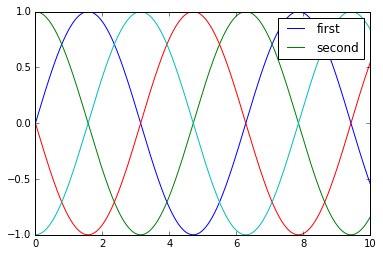
As we have already seen, the legend includes all labeled elements by
default. If this is not what is desired, we can fine-tune which elements
and labels appear in the legend by using the objects returned by plot
commands. The plt.plot() command is able to create multiple lines at
once, and returns a list of created line instances. Passing any of these
to plt.legend() will tell it which to identify, along with the
labels we’d like to specify:
y = np.sin(x[:, np.newaxis] + np.pi * np.arange(0, 2, 0.5))
lines = plt.plot(x, y)

# lines is a list of plt.Line2D instances
plt.legend(lines[:2], ['first', 'second']);

I generally find in practice that it is clearer to use the first method, applying labels to the plot elements you’d like to show on the legend:
plt.plot(x, y[:, 0], label='first')
plt.plot(x, y[:, 1], label='second')
plt.plot(x, y[:, 2:])
plt.legend(framealpha=1, frameon=True);
Sometimes the legend defaults are not sufficient for the given visualization. For example, perhaps you’re be using the size of points to mark certain features of the data, and want to create a legend reflecting this. Here is an example where we’ll use the size of points to indicate populations of California cities. We’d like a legend that specifies the scale of the sizes of the points, and we’ll accomplish this by plotting some labeled data with no entries:
import pandas as pd
cities = pd.read_csv('data/california_cities.csv')

# Extract the data we're interested in
lat, lon = cities['latd'], cities['longd']
population, area = cities['population_total'], cities['area_total_km2']

# Scatter the points, using size and color but no label
plt.scatter(lon, lat, label=None, c=np.log10(population), cmap='viridis', s=area, linewidth=0, alpha=0.5)
plt.axis(aspect='equal')
plt.xlabel('longitude')
plt.ylabel('latitude')
plt.colorbar(label='log$_{10}$(population)')
plt.clim(3, 7)

# Here we create a legend:
# we'll plot empty lists with the desired size and label
for area in [100, 300, 500]:
    plt.scatter([], [], c='k', alpha=0.3, s=area, label=str(area) + ' km$^2$')
plt.legend(scatterpoints=1, frameon=False, labelspacing=1, title='City Area')

plt.title('California Cities: Area and Population');
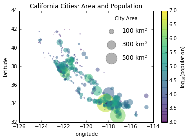
The legend will always reference some object that is on the plot, so if we’d like to display a particular shape we need to plot it. In this case, the objects we want (gray circles) are not on the plot, so we fake them by plotting empty lists. Notice too that the legend only lists plot elements that have a label specified.
By plotting empty lists, we create labeled plot objects which are picked up by the legend, and now our legend tells us some useful information. This strategy can be useful for creating more sophisticated visualizations.
Finally, note that for geographic data like this, it would be clearer if we could show state boundaries or other map-specific elements.
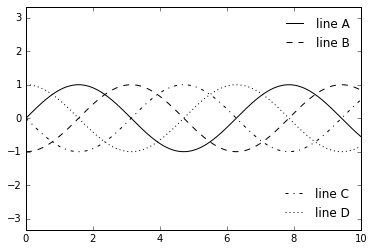
Sometimes when designing a plot you’d like to add multiple legends to
the same axes. Unfortunately, Matplotlib does not make this easy: via
the standard legend interface, it is only possible to create a
single legend for the entire plot. If you try to create a second legend
using plt.legend() or ax.legend(), it will simply override the
first one. We can work around this by creating a new legend artist from
scratch, and then using the lower-level ax.add_artist() method to
manually add the second artist to the plot:
fig, ax = plt.subplots()

lines = []
styles = ['-', '--', '-.', ':']
x = np.linspace(0, 10, 1000)

for i in range(4):
    lines += ax.plot(x, np.sin(x - i * np.pi / 2), styles[i], color='black')
ax.axis('equal')

# specify the lines and labels of the first legend
ax.legend(lines[:2], ['line A', 'line B'], loc='upper right', frameon=False)

# Create the second legend and add the artist manually.
from matplotlib.legend import Legend
leg = Legend(ax, lines[2:], ['line C', 'line D'], loc='lower right', frameon=False)
ax.add_artist(leg);
Customizing Colorbars
Plot legends identify discrete labels of discrete points. For continuous labels based on the color of points, lines, or regions, a labeled colorbar can be a great tool. In Matplotlib, a colorbar is a separate axes that can provide a key for the meaning of colors in a plot. Because the book is printed in black-and-white, this section has an accompanying online supplement where you can view the figures in full color (https://github.com/jakevdp/PythonDataScienceHandbook). We’ll start by setting up the notebook for plotting and importing the functions we will use:
import matplotlib.pyplot as plt
plt.style.use('classic')
%matplotlib inline
import numpy as np
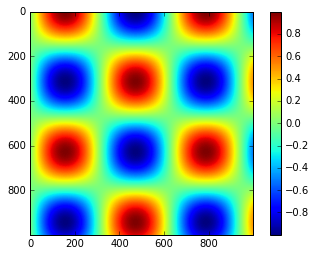
As we have seen several times throughout this section, the simplest
colorbar can be created with the plt.colorbar function:
x = np.linspace(0, 10, 1000)
I = np.sin(x) * np.cos(x[:, np.newaxis])

plt.imshow(I)
plt.colorbar();
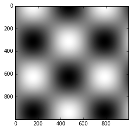
The colormap can be specified using the cmap argument to the
plotting function that is creating the visualization:
plt.imshow(I, cmap='gray');
Choosing the Colormap
A full treatment of color choice within visualization is beyond the scope of this book, but for entertaining reading on this subject and others, see the article “Ten Simple Rules for Better Figures”. Matplotlib’s online documentation also has an interesting discussion of colormap choice.
Broadly, you should be aware of three different categories of colormaps:
Sequential colormaps: These are made up of one continuous sequence of colors (e.g.,
binaryorviridis).Divergent colormaps: These usually contain two distinct colors, which show positive and negative deviations from a mean (e.g.,
RdBuorPuOr).Qualitative colormaps: these mix colors with no particular sequence (e.g.,
rainboworjet).
The jet colormap, which was the default in Matplotlib prior to
version 2.0, is an example of a qualitative colormap. Its status as the
default was quite unfortunate, because qualitative maps are often a poor
choice for representing quantitative data. Among the problems is the
fact that qualitative maps usually do not display any uniform
progression in brightness as the scale increases.
We can see this by converting the jet colorbar into black and white:
from matplotlib.colors import LinearSegmentedColormap

def grayscale_cmap(cmap):
    """Return a grayscale version of the given colormap"""
    cmap = plt.cm.get_cmap(cmap)
    colors = cmap(np.arange(cmap.N))

    # convert RGBA to perceived grayscale luminance
    # cf. http://alienryderflex.com/hsp.html
    RGB_weight = [0.299, 0.587, 0.114]
    luminance = np.sqrt(np.dot(colors[:, :3] ** 2, RGB_weight))
    colors[:, :3] = luminance[:, np.newaxis]

    return LinearSegmentedColormap.from_list(cmap.name + "_gray", colors, cmap.N)


def view_colormap(cmap):
    """Plot a colormap with its grayscale equivalent"""
    cmap = plt.cm.get_cmap(cmap)
    colors = cmap(np.arange(cmap.N))

    cmap = grayscale_cmap(cmap)
    grayscale = cmap(np.arange(cmap.N))

    fig, ax = plt.subplots(2, figsize=(6, 2), subplot_kw=dict(xticks=[], yticks=[]))
    ax[0].imshow([colors], extent=[0, 10, 0, 1])
    ax[1].imshow([grayscale], extent=[0, 10, 0, 1])
view_colormap('jet')

Notice the bright stripes in the grayscale image. Even in full color,
this uneven brightness means that the eye will be drawn to certain
portions of the color range, which will potentially emphasize
unimportant parts of the dataset. It’s better to use a colormap such as
viridis (the default as of Matplotlib 2.0), which is specifically
constructed to have an even brightness variation across the range.
Thus it not only plays well with our color perception, but also will translate well to grayscale printing:
view_colormap('viridis')

If you favor rainbow schemes, another good option for continuous data is
the cubehelix colormap:
view_colormap('cubehelix')

For other situations, such as showing positive and negative deviations
from some mean, dual-color colorbars such as RdBu (Red-Blue) can
be useful. However, as you can see in the following figure, it’s
important to note that the positive-negative information will be lost
upon translation to grayscale!
view_colormap('RdBu')

Color limits and extensions
Matplotlib allows for a large range of colorbar customization. The
colorbar itself is simply an instance of plt.Axes, so all of the
axes and tick formatting tricks we’ve learned are applicable. The
colorbar has some interesting flexibility: for example, we can narrow
the color limits and indicate the out-of-bounds values with a triangular
arrow at the top and bottom by setting the extend property. This
might come in handy, for example, if displaying an image that is subject
to noise:
# make noise in 1% of the image pixels
speckles = (np.random.random(I.shape) < 0.01)
I[speckles] = np.random.normal(0, 3, np.count_nonzero(speckles))

plt.figure(figsize=(10, 3.5))

plt.subplot(1, 2, 1)
plt.imshow(I, cmap='RdBu')
plt.colorbar()

plt.subplot(1, 2, 2)
plt.imshow(I, cmap='RdBu')
plt.colorbar(extend='both')
plt.clim(-1, 1);
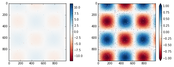
Notice that in the left panel, the default color limits respond to the noisy pixels, and the range of the noise completely washes-out the pattern we are interested in. In the right panel, we manually set the color limits, and add extensions to indicate values which are above or below those limits. The result is a much more useful visualization of our data.
Discrete Color Bars
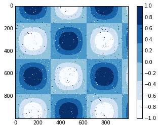
Colormaps are by default continuous, but sometimes you’d like to
represent discrete values. The easiest way to do this is to use the
plt.cm.get_cmap() function, and pass the name of a suitable colormap
along with the number of desired bins:
plt.imshow(I, cmap=plt.cm.get_cmap('Blues', 6))
plt.colorbar()
plt.clim(-1, 1);
Example: Handwritten Digits
For an example of where this might be useful, let’s look at an interesting visualization of some hand written digits data. This data is included in Scikit-Learn, and consists of nearly 2,000 \(8 \times 8\) thumbnails showing various hand-written digits.
For now, let’s start by downloading the digits data and visualizing
several of the example images with plt.imshow():
# load images of the digits 0 through 5 and visualize several of them
from sklearn.datasets import load_digits
digits = load_digits(n_class=6)

fig, ax = plt.subplots(8, 8, figsize=(6, 6))
for i, axi in enumerate(ax.flat):
    axi.imshow(digits.images[i], cmap='binary')
    axi.set(xticks=[], yticks=[])
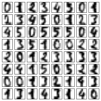
Because each digit is defined by the hue of its 64 pixels, we can consider each digit to be a point lying in 64-dimensional space: each dimension represents the brightness of one pixel. But visualizing relationships in such high-dimensional spaces can be extremely difficult. One way to approach this is to use a dimensionality reduction technique such as manifold learning to reduce the dimensionality of the data while maintaining the relationships of interest.
Deferring the discussion of these details, let’s take a look at a two-dimensional manifold learning projection of this digits data:
# project the digits into 2 dimensions using IsoMap
from sklearn.manifold import Isomap
iso = Isomap(n_components=2)
projection = iso.fit_transform(digits.data)
We’ll use our discrete colormap to view the results, setting the
ticks and clim to improve the aesthetics of the resulting
colorbar:
# plot the results
plt.scatter(projection[:, 0], projection[:, 1], lw=0.1,
            c=digits.target, cmap=plt.cm.get_cmap('cubehelix', 6))
plt.colorbar(ticks=range(6), label='digit value')
plt.clim(-0.5, 5.5)
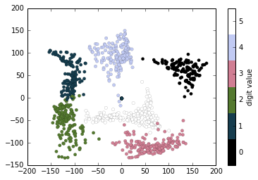
The projection also gives us some interesting insights on the relationships within the dataset: for example, the ranges of 5 and 3 nearly overlap in this projection, indicating that some hand written fives and threes are difficult to distinguish, and therefore more likely to be confused by an automated classification algorithm. Other values, like 0 and 1, are more distantly separated, and therefore much less likely to be confused. This observation agrees with our intuition, because 5 and 3 look much more similar than do 0 and 1.
Multiple Subplots
Sometimes it is helpful to compare different views of data side by side. To this end, Matplotlib has the concept of subplots: groups of smaller axes that can exist together within a single figure. These subplots might be insets, grids of plots, or other more complicated layouts. In this section we’ll explore four routines for creating subplots in Matplotlib.
%matplotlib inline
import matplotlib.pyplot as plt
plt.style.use('seaborn-white')
import numpy as np
The most basic method of creating an axes is to use the plt.axes
function. As we’ve seen previously, by default this creates a standard
axes object that fills the entire figure. plt.axes also takes an
optional argument that is a list of four numbers in the figure
coordinate system. These numbers represent
[left, bottom, width, height] in the figure coordinate system, which
ranges from 0 at the bottom left of the figure to 1 at the top right of
the figure.
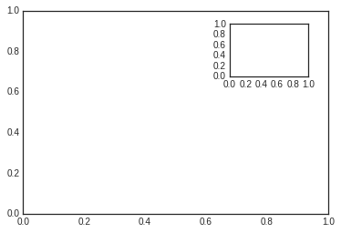
For example, we might create an inset axes at the top-right corner of another axes by setting the x and y position to 0.65 (that is, starting at 65% of the width and 65% of the height of the figure) and the x and y extents to 0.2 (that is, the size of the axes is 20% of the width and 20% of the height of the figure):
ax1 = plt.axes()  # standard axes
ax2 = plt.axes([0.65, 0.65, 0.2, 0.2])
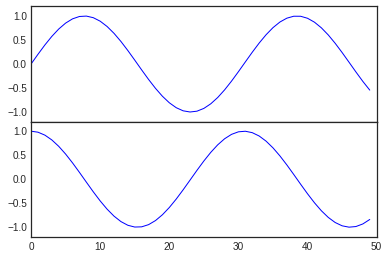
The equivalent of this command within the object-oriented interface is
fig.add_axes(). Let’s use this to create two vertically stacked
axes:
fig = plt.figure()
ax1 = fig.add_axes([0.1, 0.5, 0.8, 0.4],
                   xticklabels=[], ylim=(-1.2, 1.2))
ax2 = fig.add_axes([0.1, 0.1, 0.8, 0.4],
                   ylim=(-1.2, 1.2))

x = np.linspace(0, 10)
ax1.plot(np.sin(x))
ax2.plot(np.cos(x));
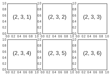
Aligned columns or rows of subplots are a common-enough need that
Matplotlib has several convenience routines that make them easy to
create. The lowest level of these is plt.subplot(), which creates a
single subplot within a grid. As you can see, this command takes three
integer arguments—the number of rows, the number of columns, and the
index of the plot to be created in this scheme, which runs from the
upper left to the bottom right:
for i in range(1, 7):
    plt.subplot(2, 3, i)
    plt.text(0.5, 0.5, str((2, 3, i)),
             fontsize=18, ha='center')
The command plt.subplots_adjust can be used to adjust the spacing
between these plots. The following code uses the equivalent
object-oriented command, fig.add_subplot():
fig = plt.figure()
fig.subplots_adjust(hspace=0.4, wspace=0.4)
for i in range(1, 7):
    ax = fig.add_subplot(2, 3, i)
    ax.text(0.5, 0.5, str((2, 3, i)),
           fontsize=18, ha='center')
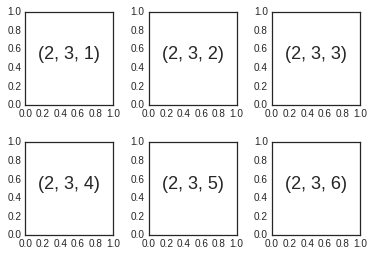
We’ve used the hspace and wspace arguments of
plt.subplots_adjust, which specify the spacing along the height and
width of the figure, in units of the subplot size (in this case, the
space is 40% of the subplot width and height).
The approach just described can become quite tedious when creating a
large grid of subplots, especially if you’d like to hide the x- and
y-axis labels on the inner plots. For this purpose, plt.subplots()
is the easier tool to use (note the s at the end of subplots).
Rather than creating a single subplot, this function creates a full grid
of subplots in a single line, returning them in a NumPy array. The
arguments are the number of rows and number of columns, along with
optional keywords sharex and sharey, which allow you to specify
the relationships between different axes.
Here we’ll create a \(2 \times 3\) grid of subplots, where all axes in the same row share their y-axis scale, and all axes in the same column share their x-axis scale:
fig, ax = plt.subplots(2, 3, sharex='col', sharey='row')
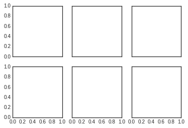
Note that by specifying sharex and sharey, we’ve automatically
removed inner labels on the grid to make the plot cleaner. The resulting
grid of axes instances is returned within a NumPy array, allowing for
convenient specification of the desired axes using standard array
indexing notation:
# axes are in a two-dimensional array, indexed by [row, col]
for i in range(2):
    for j in range(3):
        ax[i, j].text(0.5, 0.5, str((i, j)),
                      fontsize=18, ha='center')
fig
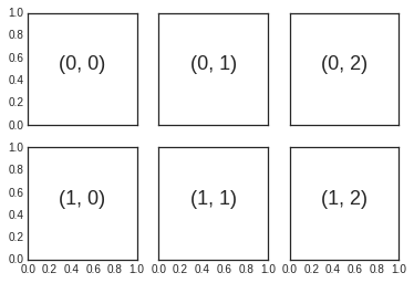
To go beyond a regular grid to subplots that span multiple rows and
columns, plt.GridSpec() is the best tool. The plt.GridSpec()
object does not create a plot by itself; it is simply a convenient
interface that is recognized by the plt.subplot() command. For
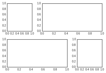
example, a gridspec for a grid of two rows and three columns with some
specified width and height space looks like this:
grid = plt.GridSpec(2, 3, wspace=0.4, hspace=0.3)
From this we can specify subplot locations and extents using the familiary Python slicing syntax:
plt.subplot(grid[0, 0])
plt.subplot(grid[0, 1:])
plt.subplot(grid[1, :2])
plt.subplot(grid[1, 2]);
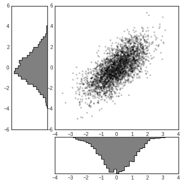
This type of flexible grid alignment has a wide range of uses. I most often use it when creating multi-axes histogram plots like the ones shown here:
# Create some normally distributed data
mean = [0, 0]
cov = [[1, 1], [1, 2]]
x, y = np.random.multivariate_normal(mean, cov, 3000).T
# Set up the axes with gridspec
fig = plt.figure(figsize=(6, 6))
grid = plt.GridSpec(4, 4, hspace=0.2, wspace=0.2)
main_ax = fig.add_subplot(grid[:-1, 1:])
y_hist = fig.add_subplot(grid[:-1, 0], xticklabels=[], sharey=main_ax)
x_hist = fig.add_subplot(grid[-1, 1:], yticklabels=[], sharex=main_ax)
# scatter points on the main axes
main_ax.plot(x, y, 'ok', markersize=3, alpha=0.2)
# histogram on the attached axes
x_hist.hist(x, 40, histtype='stepfilled', orientation='vertical', color='gray')
x_hist.invert_yaxis()
y_hist.hist(y, 40, histtype='stepfilled', orientation='horizontal', color='gray')
y_hist.invert_xaxis()
Text and Annotation
Creating a good visualization involves guiding the reader so that the figure tells a story. In some cases, this story can be told in an entirely visual manner, without the need for added text, but in others, small textual cues and labels are necessary. Perhaps the most basic types of annotations you will use are axes labels and titles, but the options go beyond this. Let’s take a look at some data and how we might visualize and annotate it to help convey interesting information. We’ll start by setting up the notebook for plotting and importing the functions we will use:
%matplotlib inline
import matplotlib.pyplot as plt
import matplotlib as mpl
plt.style.use('seaborn-whitegrid')
import numpy as np
import pandas as pd
Let’s return to some data we worked with earler, in “Example: Birthrate Data”, where we generated a plot of average births over the course of the calendar year; as already mentioned, that this data can be downloaded at https://raw.githubusercontent.com/jakevdp/data-CDCbirths/master/births.csv.
We’ll start with the same cleaning procedure we used there, and plot the results:
from datetime import datetime
births = pd.read_csv('data/births.csv')

quartiles = np.percentile(births['births'], [25, 50, 75])
mu, sig = quartiles[1], 0.74 * (quartiles[2] - quartiles[0])
births = births.query('(births > @mu - 5 * @sig) & (births < @mu + 5 * @sig)')
births['day'] = births['day'].astype(int)
births.index = pd.to_datetime(10000 * births.year + 100 * births.month + births.day, format='%Y%m%d')
births_by_date = births.pivot_table('births', [births.index.month, births.index.day])
births_by_date.index = [datetime(2012, month, day) for (month, day) in births_by_date.index]
fig, ax = plt.subplots(figsize=(12, 4))
births_by_date.plot(ax=ax);
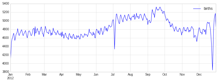
When we’re communicating data like this, it is often useful to annotate
certain features of the plot to draw the reader’s attention. This can be
done manually with the plt.text/ax.text command, which will
place text at a particular x/y value:
fig, ax = plt.subplots(figsize=(12, 4))
births_by_date.plot(ax=ax)

# Add labels to the plot
style = dict(size=10, color='gray')

ax.text('2012-1-1', 3950, "New Year's Day", **style)
ax.text('2012-7-4', 4250, "Independence Day", ha='center', **style)
ax.text('2012-9-4', 4850, "Labor Day", ha='center', **style)
ax.text('2012-10-31', 4600, "Halloween", ha='right', **style)
ax.text('2012-11-25', 4450, "Thanksgiving", ha='center', **style)
ax.text('2012-12-25', 3850, "Christmas ", ha='right', **style)

# Label the axes
ax.set(title='USA births by day of year (1969-1988)', ylabel='average daily births')

# Format the x axis with centered month labels
ax.xaxis.set_major_locator(mpl.dates.MonthLocator())
ax.xaxis.set_minor_locator(mpl.dates.MonthLocator(bymonthday=15))
ax.xaxis.set_major_formatter(plt.NullFormatter())
ax.xaxis.set_minor_formatter(mpl.dates.DateFormatter('%h'));
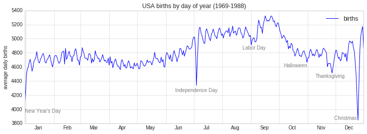
The ax.text method takes an x position, a y position, a string, and
then optional keywords specifying the color, size, style, alignment, and
other properties of the text. Here we used ha='right' and
ha='center', where ha is short for horizonal alignment. See
the docstring of plt.text() and of mpl.text.Text() for more
information on available options.
In the previous example, we have anchored our text annotations to data locations. Sometimes it’s preferable to anchor the text to a position on the axes or figure, independent of the data. In Matplotlib, this is done by modifying the transform.
Any graphics display framework needs some scheme for translating between
coordinate systems. For example, a data point at \((x, y) = (1, 1)\)
needs to somehow be represented at a certain location on the figure,
which in turn needs to be represented in pixels on the screen.
Mathematically, such coordinate transformations are relatively
straightforward, and Matplotlib has a well-developed set of tools that
it uses internally to perform them (these tools can be explored in the
matplotlib.transforms submodule).
The average user rarely needs to worry about the details of these transforms, but it is helpful knowledge to have when considering the placement of text on a figure. There are three pre-defined transforms that can be useful in this situation:
ax.transData: Transform associated with data coordinatesax.transAxes: Transform associated with the axes (in units of axes dimensions)fig.transFigure: Transform associated with the figure (in units of figure dimensions)
Here let’s look at an example of drawing text at various locations using these transforms:
fig, ax = plt.subplots(facecolor='lightgray')
ax.axis([0, 10, 0, 10])

# transform=ax.transData is the default, but we'll specify it anyway
ax.text(1, 5, ". Data: (1, 5)", transform=ax.transData)
ax.text(0.5, 0.1, ". Axes: (0.5, 0.1)", transform=ax.transAxes)
ax.text(0.2, 0.2, ". Figure: (0.2, 0.2)", transform=fig.transFigure);
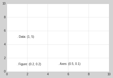
Note that by default, the text is aligned above and to the left of the specified coordinates: here the “.” at the beginning of each string will approximately mark the given coordinate location.
The transData coordinates give the usual data coordinates associated
with the x- and y-axis labels. The transAxes coordinates give the
location from the bottom-left corner of the axes (here the white box),
as a fraction of the axes size. The transFigure coordinates are
similar, but specify the position from the bottom-left of the figure
(here the gray box), as a fraction of the figure size.
Notice now that if we change the axes limits, it is only the
transData coordinates that will be affected, while the others remain
stationary:
ax.set_xlim(0, 2)
ax.set_ylim(-6, 6)
fig
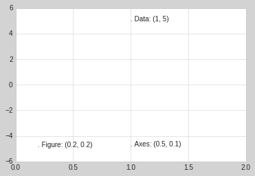
This behavior can be seen more clearly by changing the axes limits
interactively: if you are executing this code in a notebook, you can
make that happen by changing %matplotlib inline to
%matplotlib notebook and using each plot’s menu to interact with the
plot.
Along with tick marks and text, another useful annotation mark is the simple arrow.
Drawing arrows in Matplotlib is often much harder than you’d bargain
for. While there is a plt.arrow() function available, I wouldn’t
suggest using it: the arrows it creates are SVG objects that will be
subject to the varying aspect ratio of your plots, and the result is
rarely what the user intended. Instead, I’d suggest using the
plt.annotate() function. This function creates some text and an
arrow, and the arrows can be very flexibly specified.
Here we’ll use annotate with several of its options:
%matplotlib inline

fig, ax = plt.subplots()

x = np.linspace(0, 20, 1000)
ax.plot(x, np.cos(x))
ax.axis('equal')

ax.annotate('local maximum', xy=(6.28, 1), xytext=(10, 4),
            arrowprops=dict(facecolor='black', shrink=0.05))

ax.annotate('local minimum', xy=(5 * np.pi, -1), xytext=(2, -6),
            arrowprops=dict(arrowstyle="->",
                            connectionstyle="angle3,angleA=0,angleB=-90"));
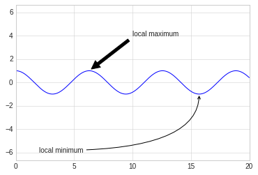
The arrow style is controlled through the arrowprops dictionary,
which has numerous options available. These options are fairly
well-documented in Matplotlib’s online documentation, so rather than
repeating them here it is probably more useful to quickly show some of
the possibilities. Let’s demonstrate several of the possible options
using the birthrate plot from before:
fig, ax = plt.subplots(figsize=(12, 4))
births_by_date.plot(ax=ax)

# Add labels to the plot
ax.annotate("New Year's Day", xy=('2012-1-1', 4100),  xycoords='data',
            xytext=(50, -30), textcoords='offset points',
            arrowprops=dict(arrowstyle="->",
                            connectionstyle="arc3,rad=-0.2"))

ax.annotate("Independence Day", xy=('2012-7-4', 4250),  xycoords='data',
            bbox=dict(boxstyle="round", fc="none", ec="gray"),
            xytext=(10, -40), textcoords='offset points', ha='center',
            arrowprops=dict(arrowstyle="->"))

ax.annotate('Labor Day', xy=('2012-9-4', 4850), xycoords='data', ha='center',
            xytext=(0, -20), textcoords='offset points')
ax.annotate('', xy=('2012-9-1', 4850), xytext=('2012-9-7', 4850),
            xycoords='data', textcoords='data',
            arrowprops={'arrowstyle': '|-|,widthA=0.2,widthB=0.2', })

ax.annotate('Halloween', xy=('2012-10-31', 4600),  xycoords='data',
            xytext=(-80, -40), textcoords='offset points',
            arrowprops=dict(arrowstyle="fancy",
                            fc="0.6", ec="none",
                            connectionstyle="angle3,angleA=0,angleB=-90"))

ax.annotate('Thanksgiving', xy=('2012-11-25', 4500),  xycoords='data',
            xytext=(-120, -60), textcoords='offset points',
            bbox=dict(boxstyle="round4,pad=.5", fc="0.9"),
            arrowprops=dict(arrowstyle="->",
                            connectionstyle="angle,angleA=0,angleB=80,rad=20"))


ax.annotate('Christmas', xy=('2012-12-25', 3850),  xycoords='data',
             xytext=(-30, 0), textcoords='offset points',
             size=13, ha='right', va="center",
             bbox=dict(boxstyle="round", alpha=0.1),
             arrowprops=dict(arrowstyle="wedge,tail_width=0.5", alpha=0.1));

# Label the axes
ax.set(title='USA births by day of year (1969-1988)',
       ylabel='average daily births')

# Format the x axis with centered month labels
ax.xaxis.set_major_locator(mpl.dates.MonthLocator())
ax.xaxis.set_minor_locator(mpl.dates.MonthLocator(bymonthday=15))
ax.xaxis.set_major_formatter(plt.NullFormatter())
ax.xaxis.set_minor_formatter(mpl.dates.DateFormatter('%h'));

ax.set_ylim(3600, 5400);
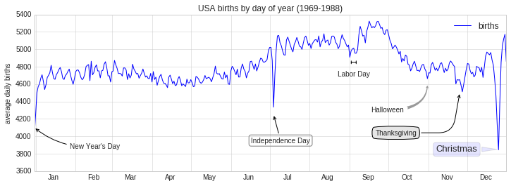
Customizing Ticks
Matplotlib’s default tick locators and formatters are designed to be generally sufficient in many common situations, but are in no way optimal for every plot. This section will give several examples of adjusting the tick locations and formatting for the particular plot type you’re interested in.
Before we go into examples, it will be best for us to understand further
the object hierarchy of Matplotlib plots. Matplotlib aims to have a
Python object representing everything that appears on the plot: for
example, recall that the figure is the bounding box within which
plot elements appear. Each Matplotlib object can also act as a container
of sub-objects: for example, each figure can contain one or more
axes objects, each of which in turn contain other objects
representing plot contents.
The tick marks are no exception. Each axes has attributes xaxis
and yaxis, which in turn have attributes that contain all the
properties of the lines, ticks, and labels that make up the axes.
Within each axis, there is the concept of a major tick mark, and a minor tick mark. As the names would imply, major ticks are usually bigger or more pronounced, while minor ticks are usually smaller. By default, Matplotlib rarely makes use of minor ticks, but one place you can see them is within logarithmic plots:
import matplotlib.pyplot as plt
plt.style.use('classic')
%matplotlib inline
import numpy as np
ax = plt.axes(xscale='log', yscale='log')
ax.grid();
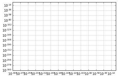
We see here that each major tick shows a large tickmark and a label, while each minor tick shows a smaller tickmark with no label.
These tick properties—locations and labels—that is, can be customized by
setting the formatter and locator objects of each axis. Let’s
examine these for the x axis of the just shown plot:
print(ax.xaxis.get_major_locator())
print(ax.xaxis.get_minor_locator())
<matplotlib.ticker.LogLocator object at 0x7ff2b92625f8>
<matplotlib.ticker.LogLocator object at 0x7ff2b92627f0>
print(ax.xaxis.get_major_formatter())
print(ax.xaxis.get_minor_formatter())
<matplotlib.ticker.LogFormatterSciNotation object at 0x7ff2b9262828>
<matplotlib.ticker.LogFormatterSciNotation object at 0x7ff2b9258c88>
We see that both major and minor tick labels have their locations
specified by a LogLocator (which makes sense for a logarithmic
plot). Minor ticks, though, have their labels formatted by a
NullFormatter: this says that no labels will be shown.
Perhaps the most common tick/label formatting operation is the act of
hiding ticks or labels. This can be done using plt.NullLocator() and
plt.NullFormatter(), as shown here:
ax = plt.axes()
ax.plot(np.random.rand(50))

ax.yaxis.set_major_locator(plt.NullLocator())
ax.xaxis.set_major_formatter(plt.NullFormatter())
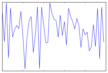
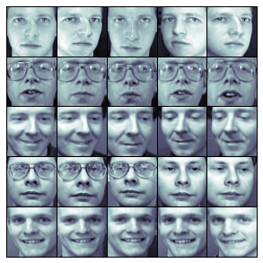
Notice that we’ve removed the labels (but kept the ticks/gridlines) from the x axis, and removed the ticks (and thus the labels as well) from the y axis. Having no ticks at all can be useful in many situations—for example, when you want to show a grid of images. For instance, consider the following figure, which includes images of different faces, an example often used in supervised machine learning problems:
fig, ax = plt.subplots(5, 5, figsize=(5, 5))
fig.subplots_adjust(hspace=0, wspace=0)

# Get some face data from scikit-learn
from sklearn.datasets import fetch_olivetti_faces
faces = fetch_olivetti_faces().images

for i in range(5):
    for j in range(5):
        ax[i, j].xaxis.set_major_locator(plt.NullLocator())
        ax[i, j].yaxis.set_major_locator(plt.NullLocator())
        ax[i, j].imshow(faces[10 * i + j], cmap="bone")
downloading Olivetti faces from https://ndownloader.figshare.com/files/5976027 to /home/mn/scikit_learn_data
One common problem with the default settings is that smaller subplots can end up with crowded labels. We can see this in the plot grid shown here:
fig, ax = plt.subplots(4, 4, sharex=True, sharey=True)
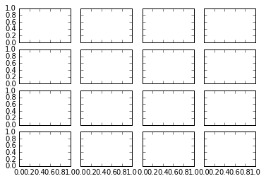
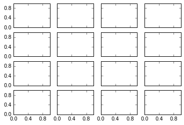
Particularly for the x ticks, the numbers nearly overlap and make them
quite difficult to decipher. We can fix this with the
plt.MaxNLocator(), which allows us to specify the maximum number of
ticks that will be displayed. Given this maximum number, Matplotlib will
use internal logic to choose the particular tick locations:
# For every axis, set the x and y major locator
for axi in ax.flat:
    axi.xaxis.set_major_locator(plt.MaxNLocator(3))
    axi.yaxis.set_major_locator(plt.MaxNLocator(3))
fig
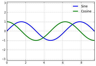
Matplotlib’s default tick formatting can leave a lot to be desired: it works well as a broad default, but sometimes you’d like do do something more. Consider this plot of a sine and a cosine:
# Plot a sine and cosine curve
fig, ax = plt.subplots()
x = np.linspace(0, 3 * np.pi, 1000)
ax.plot(x, np.sin(x), lw=3, label='Sine')
ax.plot(x, np.cos(x), lw=3, label='Cosine')

# Set up grid, legend, and limits
ax.grid(True)
ax.legend(frameon=False)
ax.axis('equal')
ax.set_xlim(0, 3 * np.pi);
There are a couple changes we might like to make. First, it’s more
natural for this data to space the ticks and grid lines in multiples of
\(\pi\). We can do this by setting a MultipleLocator, which
locates ticks at a multiple of the number you provide. For good measure,
we’ll add both major and minor ticks in multiples of \(\pi/4\):
ax.xaxis.set_major_locator(plt.MultipleLocator(np.pi / 2))
ax.xaxis.set_minor_locator(plt.MultipleLocator(np.pi / 4))
fig
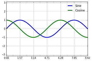
But now these tick labels look a little bit silly: we can see that they
are multiples of \(\pi\), but the decimal representation does not
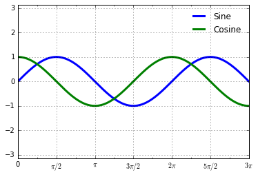
immediately convey this. To fix this, we can change the tick formatter.
There’s no built-in formatter for what we want to do, so we’ll instead
use plt.FuncFormatter, which accepts a user-defined function giving
fine-grained control over the tick outputs:
def format_func(value, tick_number):
    # find number of multiples of pi/2
    N = int(np.round(2 * value / np.pi))
    if N == 0:
        return "0"
    elif N == 1:
        return r"$\pi/2$"
    elif N == 2:
        return r"$\pi$"
    elif N % 2 > 0:
        return r"${0}\pi/2$".format(N)
    else:
        return r"${0}\pi$".format(N // 2)

ax.xaxis.set_major_formatter(plt.FuncFormatter(format_func))
fig
We’ve mentioned a couple of the available formatters and locators. We’ll
conclude this section by briefly listing all the built-in locator and
formatter options. For more information on any of these, refer to the
docstrings or to the Matplotlib online documentaion. Each of the
following is available in the plt namespace:
Locator class |
Description |
|---|---|
|
No ticks |
|
Tick locations are fixed |
|
Locator for index plots (e.g., where x = range(len(y))) |
|
Evenly spaced ticks from min to max |
|
Logarithmically ticks from min to max |
|
Ticks and range are a multiple of base |
|
Finds up to a max number of ticks at nice locations |
|
(Default.) MaxNLocator with simple defaults. |
|
Locator for minor ticks |
Formatter Class |
Description |
|---|---|
|
No labels on the ticks |
|
Set the strings from a list of labels |
|
Set the strings manually for the labels |
|
User-defined function sets the labels |
|
Use a format string for each value |
|
(Default.) Formatter for scalar values |
|
Default formatter for log axes |
Customizing Matplotlib: Configurations and Stylesheets
Matplotlib’s default plot settings are often the subject of complaint among its users. While much is slated to change in the 2.0 Matplotlib release in late 2016, the ability to customize default settings helps bring the package inline with your own aesthetic preferences.
Here we’ll walk through some of Matplotlib’s runtime configuration (rc) options, and take a look at the newer stylesheets feature, which contains some nice sets of default configurations.
Through this chapter, we’ve seen how it is possible to tweak individual plot settings to end up with something that looks a little bit nicer than the default. It’s possible to do these customizations for each individual plot. For example, here is a fairly drab default histogram:
import matplotlib.pyplot as plt
plt.style.use('classic')
import numpy as np

%matplotlib inline
x = np.random.randn(1000)
plt.hist(x);
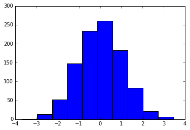
We can adjust this by hand to make it a much more visually pleasing plot:
# use a gray background
ax = plt.axes()
ax.set_axisbelow(True)

# draw solid white grid lines
plt.grid(color='w', linestyle='solid')

# hide axis spines
for spine in ax.spines.values():
    spine.set_visible(False)

# hide top and right ticks
ax.xaxis.tick_bottom()
ax.yaxis.tick_left()

# lighten ticks and labels
ax.tick_params(colors='gray', direction='out')
for tick in ax.get_xticklabels():
    tick.set_color('gray')
for tick in ax.get_yticklabels():
    tick.set_color('gray')

# control face and edge color of histogram
ax.hist(x, edgecolor='#E6E6E6', color='#EE6666');
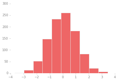
Each time Matplotlib loads, it defines a runtime configuration (rc)
containing the default styles for every plot element you create. This
configuration can be adjusted at any time using the plt.rc
convenience routine. Let’s see what it looks like to modify the rc
parameters so that our default plot will look similar to what we did
before.
We’ll start by saving a copy of the current rcParams dictionary, so
we can easily reset these changes in the current session:
IPython_default = plt.rcParams.copy()
Now we can use the plt.rc function to change some of these settings:
from matplotlib import cycler
colors = cycler('color',
                ['#EE6666', '#3388BB', '#9988DD',
                 '#EECC55', '#88BB44', '#FFBBBB'])
plt.rc('axes', facecolor='#E6E6E6', edgecolor='none',
       axisbelow=True, grid=True, prop_cycle=colors)
plt.rc('grid', color='w', linestyle='solid')
plt.rc('xtick', direction='out', color='gray')
plt.rc('ytick', direction='out', color='gray')
plt.rc('patch', edgecolor='#E6E6E6')
plt.rc('lines', linewidth=2)
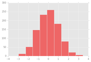
With these settings defined, we can now create a plot and see our settings in action:
plt.hist(x);
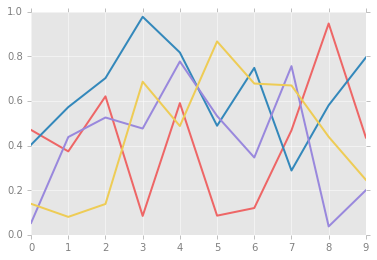
Let’s see what simple line plots look like with these rc parameters:
for i in range(4):
    plt.plot(np.random.rand(10))
The version 1.4 release of Matplotlib in August 2014 added a very
convenient style module, which includes a number of new default
stylesheets, as well as the ability to create and package your own
styles. These stylesheets are formatted similarly to the .matplotlibrc
files mentioned earlier, but must be named with a .mplstyle extension.
Even if you don’t create your own style, the stylesheets included by
default are extremely useful. The available styles are listed in
plt.style.available—here I’ll list only the first five for brevity:
plt.style.available[:5]
['seaborn-poster',
 'seaborn-muted',
 'seaborn-dark-palette',
 'seaborn-bright',
 'seaborn-ticks']
The basic way to switch to a stylesheet is to call
plt.style.use('stylename')
But keep in mind that this will change the style for the rest of the session! Alternatively, you can use the style context manager, which sets a style temporarily:
with plt.style.context('stylename'):
    make_a_plot()
Let’s create a function that will make two basic types of plot:
def hist_and_lines():
    np.random.seed(0)
    fig, ax = plt.subplots(1, 2, figsize=(11, 4))
    ax[0].hist(np.random.randn(1000))
    for i in range(3):
        ax[1].plot(np.random.rand(10))
    ax[1].legend(['a', 'b', 'c'], loc='lower left')
Default style
The default style is what we’ve been seeing so far throughout the book; we’ll start with that. First, let’s reset our runtime configuration to the notebook default:
# reset rcParams
plt.rcParams.update(IPython_default);
Now let’s see how it looks:
hist_and_lines()

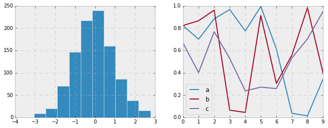
FiveThiryEight style
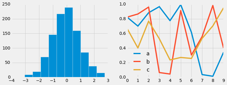
The fivethirtyeight style mimics the graphics found on the popular
FiveThirtyEight website. As you can
see here, it is typified by bold colors, thick lines, and transparent
axes:
with plt.style.context('fivethirtyeight'):
    hist_and_lines()
ggplot
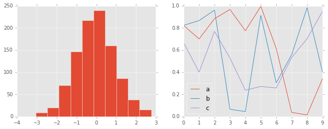
The ggplot package in the R language is a very popular visualization
tool. Matplotlib’s ggplot style mimics the default styles from that
package:
with plt.style.context('ggplot'):
    hist_and_lines()
Bayesian Methods for Hackers style
There is a very nice short online book called Probabilistic Programming
and Bayesian Methods for
Hackers;
it features figures created with Matplotlib, and uses a nice set of rc
parameters to create a consistent and visually-appealing style
throughout the book. This style is reproduced in the bmh stylesheet:
with plt.style.context('bmh'):
    hist_and_lines()
Seaborn style
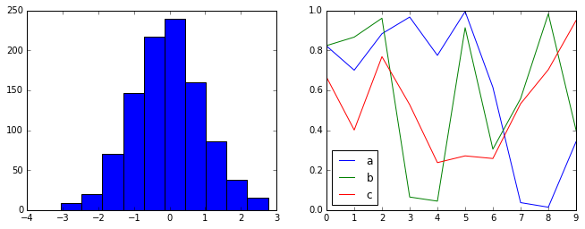
Matplotlib also has stylesheets inspired by the Seaborn library. As we will see, these styles are loaded automatically when Seaborn is imported into a notebook. I’ve found these settings to be very nice, and tend to use them as defaults in my own data exploration.
import seaborn
hist_and_lines()
Three-Dimensional Plotting in Matplotlib
Matplotlib was initially designed with only two-dimensional plotting in
mind. Around the time of the 1.0 release, some three-dimensional
plotting utilities were built on top of Matplotlib’s two-dimensional
display, and the result is a convenient (if somewhat limited) set of
tools for three-dimensional data visualization. three-dimensional plots
are enabled by importing the mplot3d toolkit, included with the main
Matplotlib installation:
from mpl_toolkits import mplot3d
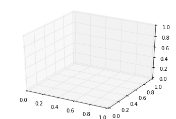
Once this submodule is imported, a three-dimensional axes can be created
by passing the keyword projection='3d' to any of the normal axes
creation routines:
%matplotlib inline
import numpy as np
import matplotlib.pyplot as plt
fig = plt.figure()
ax = plt.axes(projection='3d')
With this three-dimensional axes enabled, we can now plot a variety of
three-dimensional plot types. Three-dimensional plotting is one of the
functionalities that benefits immensely from viewing figures
interactively rather than statically in the notebook; recall that to use
interactive figures, you can use %matplotlib notebook rather than
%matplotlib inline when running this code.
The most basic three-dimensional plot is a line or collection of scatter
plot created from sets of (x, y, z) triples. In analogy with the more
common two-dimensional plots discussed earlier, these can be created
using the ax.plot3D and ax.scatter3D functions. The call
signature for these is nearly identical to that of their two-dimensional
counterparts, so you can refer to Simple Line
Plots and Simple Scatter
Plots for more information on
controlling the output.
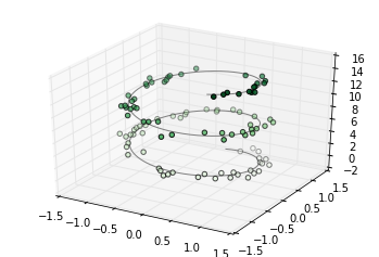
Here we’ll plot a trigonometric spiral, along with some points drawn randomly near the line:
ax = plt.axes(projection='3d')

# Data for a three-dimensional line
zline = np.linspace(0, 15, 1000)
xline = np.sin(zline)
yline = np.cos(zline)
ax.plot3D(xline, yline, zline, 'gray')

# Data for three-dimensional scattered points
zdata = 15 * np.random.random(100)
xdata = np.sin(zdata) + 0.1 * np.random.randn(100)
ydata = np.cos(zdata) + 0.1 * np.random.randn(100)
ax.scatter3D(xdata, ydata, zdata, c=zdata, cmap='Greens');
Analogous to the contour plots contains tools to create
three-dimensional relief plots using the same inputs. Like
two-dimensional ax.contour plots, ax.contour3D requires all the
input data to be in the form of two-dimensional regular grids, with the
Z data evaluated at each point. Here we’ll show a three-dimensional
contour diagram of a three-dimensional sinusoidal function:
def f(x, y):
    return np.sin(np.sqrt(x ** 2 + y ** 2))

x = np.linspace(-6, 6, 30)
y = np.linspace(-6, 6, 30)

X, Y = np.meshgrid(x, y)
Z = f(X, Y)
fig = plt.figure()
ax = plt.axes(projection='3d')
ax.contour3D(X, Y, Z, 50, cmap='binary')
ax.set_xlabel('x')
ax.set_ylabel('y')
ax.set_zlabel('z');
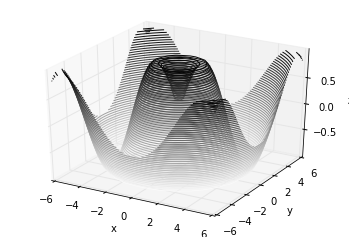
Sometimes the default viewing angle is not optimal, in which case we can
use the view_init method to set the elevation and azimuthal angles.
In the following example, we’ll use an elevation of 60 degrees (that is,
60 degrees above the x-y plane) and an azimuth of 35 degrees (that is,
rotated 35 degrees counter-clockwise about the z-axis):
ax.view_init(60, 35)
fig
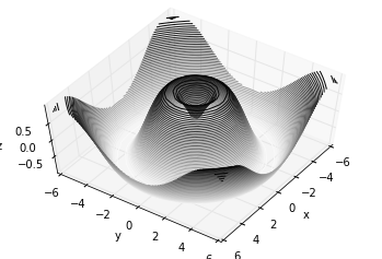
Two other types of three-dimensional plots that work on gridded data are wireframes and surface plots. These take a grid of values and project it onto the specified three-dimensional surface, and can make the resulting three-dimensional forms quite easy to visualize. Here’s an example of using a wireframe:
fig = plt.figure()
ax = plt.axes(projection='3d')
ax.plot_wireframe(X, Y, Z, color='black')
ax.set_title('wireframe');
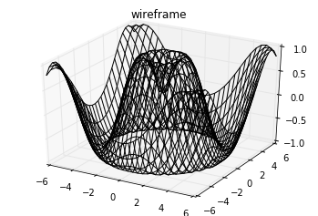
A surface plot is like a wireframe plot, but each face of the wireframe is a filled polygon. Adding a colormap to the filled polygons can aid perception of the topology of the surface being visualized:
ax = plt.axes(projection='3d')
ax.plot_surface(X, Y, Z, rstride=1, cstride=1,
                cmap='viridis', edgecolor='none')
ax.set_title('surface');
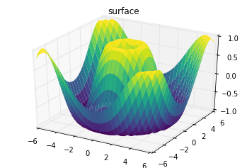
Note that though the grid of values for a surface plot needs to be
two-dimensional, it need not be rectilinear. Here is an example of
creating a partial polar grid, which when used with the surface3D
plot can give us a slice into the function we’re visualizing:
r = np.linspace(0, 6, 20)
theta = np.linspace(-0.9 * np.pi, 0.8 * np.pi, 40)
r, theta = np.meshgrid(r, theta)

X = r * np.sin(theta)
Y = r * np.cos(theta)
Z = f(X, Y)

ax = plt.axes(projection='3d')
ax.plot_surface(X, Y, Z, rstride=1, cstride=1,
                cmap='viridis', edgecolor='none');
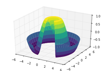
For some applications, the evenly sampled grids required by the above routines is overly restrictive and inconvenient. In these situations, the triangulation-based plots can be very useful. What if rather than an even draw from a Cartesian or a polar grid, we instead have a set of random draws?
theta = 2 * np.pi * np.random.random(1000)
r = 6 * np.random.random(1000)
x = np.ravel(r * np.sin(theta))
y = np.ravel(r * np.cos(theta))
z = f(x, y)
We could create a scatter plot of the points to get an idea of the surface we’re sampling from:
ax = plt.axes(projection='3d')
ax.scatter(x, y, z, c=z, cmap='viridis', linewidth=0.5);
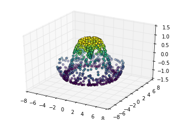
This leaves a lot to be desired. The function that will help us in this
case is ax.plot_trisurf, which creates a surface by first finding a
set of triangles formed between adjacent points (remember that x, y, and
z here are one-dimensional arrays):
ax = plt.axes(projection='3d')
ax.plot_trisurf(x, y, z,
                cmap='viridis', edgecolor='none');
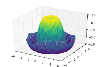
Example: Visualizing a Möbius strip
A Möbius strip is similar to a strip of paper glued into a loop with a half-twist. Topologically, it’s quite interesting because despite appearances it has only a single side! Here we will visualize such an object using Matplotlib’s three-dimensional tools. The key to creating the Möbius strip is to think about it’s parametrization: it’s a two-dimensional strip, so we need two intrinsic dimensions. Let’s call them \(\theta\), which ranges from \(0\) to \(2\pi\) around the loop, and \(w\) which ranges from -1 to 1 across the width of the strip:
theta = np.linspace(0, 2 * np.pi, 30)
w = np.linspace(-0.25, 0.25, 8)
w, theta = np.meshgrid(w, theta)
Now from this parametrization, we must determine the (x, y, z) positions of the embedded strip.
Thinking about it, we might realize that there are two rotations happening: one is the position of the loop about its center (what we’ve called \(\theta\)), while the other is the twisting of the strip about its axis (we’ll call this \(\phi\)). For a Möbius strip, we must have the strip makes half a twist during a full loop, or \(\Delta\phi = \Delta\theta/2\).
phi = 0.5 * theta
Now we use our recollection of trigonometry to derive the three-dimensional embedding. We’ll define \(r\), the distance of each point from the center, and use this to find the embedded \((x, y, z)\) coordinates:
# radius in x-y plane
r = 1 + w * np.cos(phi)

x = np.ravel(r * np.cos(theta))
y = np.ravel(r * np.sin(theta))
z = np.ravel(w * np.sin(phi))
Finally, to plot the object, we must make sure the triangulation is correct. The best way to do this is to define the triangulation within the underlying parametrization, and then let Matplotlib project this triangulation into the three-dimensional space of the Möbius strip. This can be accomplished as follows:
# triangulate in the underlying parametrization
from matplotlib.tri import Triangulation
tri = Triangulation(np.ravel(w), np.ravel(theta))

ax = plt.axes(projection='3d')
ax.plot_trisurf(x, y, z, triangles=tri.triangles,
                cmap='viridis', linewidths=0.2);

ax.set_xlim(-1, 1); ax.set_ylim(-1, 1); ax.set_zlim(-1, 1);
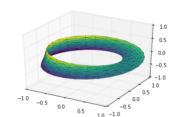
Visualization with Seaborn
Matplotlib has proven to be an incredibly useful and popular visualization tool, but even avid users will admit it often leaves much to be desired. There are several valid complaints about Matplotlib that often come up:
Prior to version 2.0, Matplotlib’s defaults are not exactly the best choices. It was based off of MATLAB circa 1999, and this often shows.
Matplotlib’s API is relatively low level. Doing sophisticated statistical visualization is possible, but often requires a lot of boilerplate code.
Matplotlib predated Pandas by more than a decade, and thus is not designed for use with Pandas
DataFrames. In order to visualize data from a PandasDataFrame, you must extract eachSeriesand often concatenate them together into the right format. It would be nicer to have a plotting library that can intelligently use theDataFramelabels in a plot.
An answer to these problems is Seaborn.
Seaborn provides an API on top of Matplotlib that offers sane choices
for plot style and color defaults, defines simple high-level functions
for common statistical plot types, and integrates with the functionality
provided by Pandas DataFrames.
To be fair, the Matplotlib team is addressing this: it has recently
added the plt.style tools, and is starting to handle Pandas data
more seamlessly. The 2.0 release of the library will include a new
default stylesheet that will improve on the current status quo. But for
all the reasons just discussed, Seaborn remains an extremely useful
addon.
Here is an example of a simple random-walk plot in Matplotlib, using its classic plot formatting and colors. We start with the typical imports:
import matplotlib.pyplot as plt
plt.style.use('classic')
%matplotlib inline
import numpy as np
import pandas as pd
Now we create some random walk data:
# Create some data
rng = np.random.RandomState(0)
x = np.linspace(0, 10, 500)
y = np.cumsum(rng.randn(500, 6), 0)
And do a simple plot:
# Plot the data with Matplotlib defaults
plt.plot(x, y)
plt.legend('ABCDEF', ncol=2, loc='upper left');
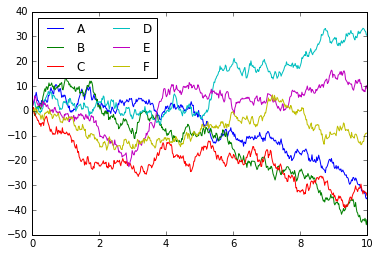
Although the result contains all the information we’d like it to convey, it does so in a way that is not all that aesthetically pleasing, and even looks a bit old-fashioned in the context of 21st-century data visualization.
Now let’s take a look at how it works with Seaborn. As we will see,
Seaborn has many of its own high-level plotting routines, but it can
also overwrite Matplotlib’s default parameters and in turn get even
simple Matplotlib scripts to produce vastly superior output. We can set
the style by calling Seaborn’s set() method. By convention, Seaborn
is imported as sns:
import seaborn as sns
sns.set()
Now let’s rerun the same two lines as before:
# same plotting code as above!
plt.plot(x, y)
plt.legend('ABCDEF', ncol=2, loc='upper left');
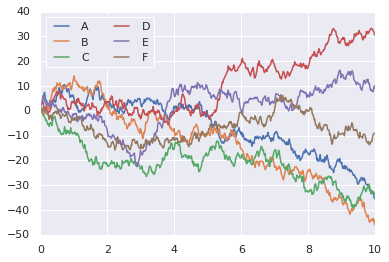
The main idea of Seaborn is that it provides high-level commands to create a variety of plot types useful for statistical data exploration, and even some statistical model fitting.
Let’s take a look at a few of the datasets and plot types available in Seaborn. Note that all of the following could be done using raw Matplotlib commands (this is, in fact, what Seaborn does under the hood) but the Seaborn API is much more convenient.
Histograms, KDE, and densities
Often in statistical data visualization, all you want is to plot histograms and joint distributions of variables. We have seen that this is relatively straightforward in Matplotlib:
data = np.random.multivariate_normal([0, 0], [[5, 2], [2, 2]], size=2000)
data = pd.DataFrame(data, columns=['x', 'y'])

for col in 'xy':
    plt.hist(data[col], density=True, alpha=0.5)
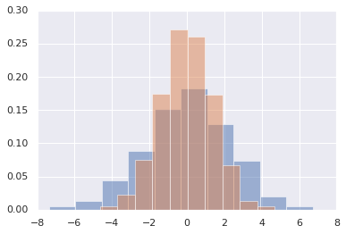
Rather than a histogram, we can get a smooth estimate of the
distribution using a kernel density estimation, which Seaborn does with
sns.kdeplot:
for col in 'xy':
    sns.kdeplot(data[col], shade=True)
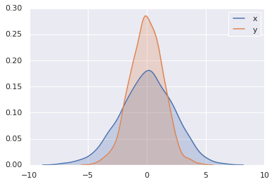
Histograms and KDE can be combined using distplot:
sns.distplot(data['x'])
sns.distplot(data['y']);
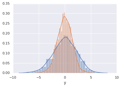
If we pass the full two-dimensional dataset to kdeplot, we will get
a two-dimensional visualization of the data:
sns.kdeplot(data);
/home/mn/Developer/working-copies/pythons/venv/lib/python3.7/site-packages/seaborn/distributions.py:693: UserWarning: Passing a 2D dataset for a bivariate plot is deprecated in favor of kdeplot(x, y), and it will cause an error in future versions. Please update your code.
  warnings.warn(warn_msg, UserWarning)
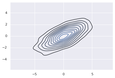
We can see the joint distribution and the marginal distributions
together using sns.jointplot. For this plot, we’ll set the style to
a white background:
with sns.axes_style('white'):
    sns.jointplot("x", "y", data, kind='kde');
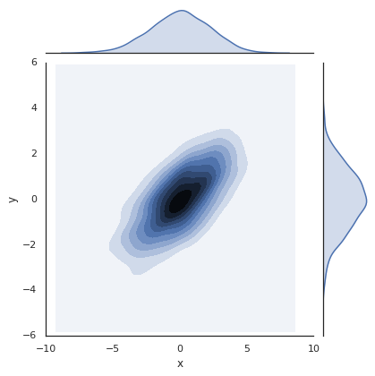
There are other parameters that can be passed to jointplot—for
example, we can use a hexagonally based histogram instead:
with sns.axes_style('white'):
    sns.jointplot("x", "y", data, kind='hex')
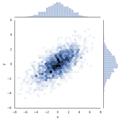
Pair plots
When you generalize joint plots to datasets of larger dimensions, you end up with pair plots. This is very useful for exploring correlations between multidimensional data, when you’d like to plot all pairs of values against each other.
We’ll demo this with the well-known Iris dataset, which lists measurements of petals and sepals of three iris species:
iris = sns.load_dataset("iris")
iris.head()
| sepal_length | sepal_width | petal_length | petal_width | species | |
|---|---|---|---|---|---|
| 0 | 5.1 | 3.5 | 1.4 | 0.2 | setosa |
| 1 | 4.9 | 3.0 | 1.4 | 0.2 | setosa |
| 2 | 4.7 | 3.2 | 1.3 | 0.2 | setosa |
| 3 | 4.6 | 3.1 | 1.5 | 0.2 | setosa |
| 4 | 5.0 | 3.6 | 1.4 | 0.2 | setosa |
Visualizing the multidimensional relationships among the samples is as
easy as calling sns.pairplot:
sns.pairplot(iris, hue='species');
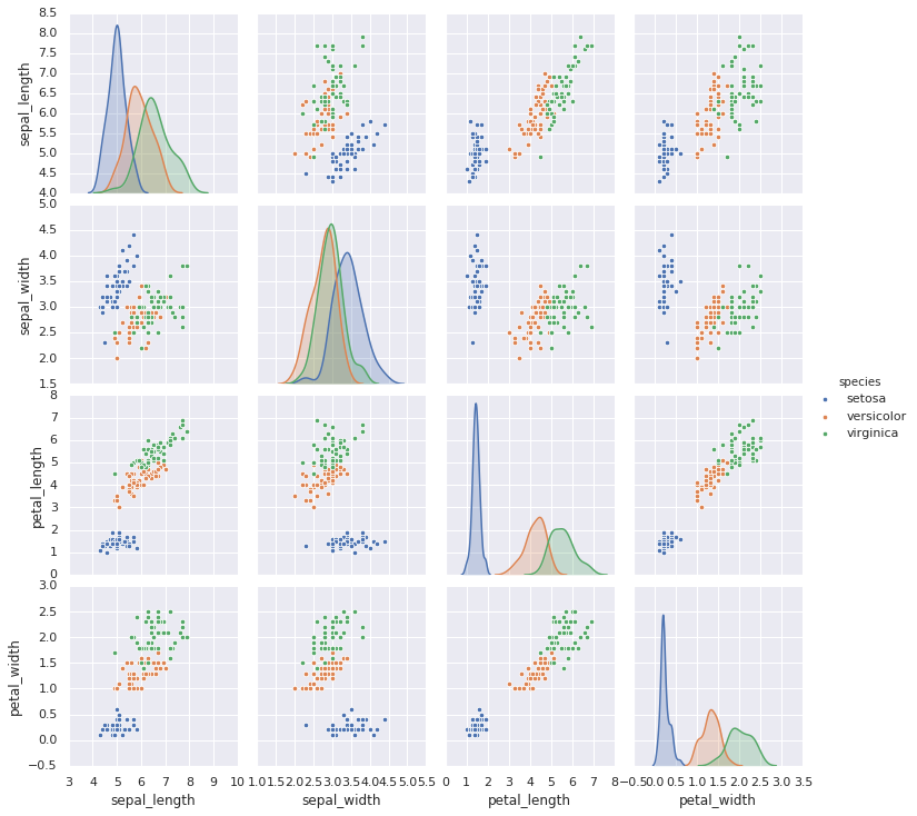
Faceted histograms
Sometimes the best way to view data is via histograms of subsets.
Seaborn’s FacetGrid makes this extremely simple. We’ll take a look
at some data that shows the amount that restaurant staff receive in tips
based on various indicator data:
tips = sns.load_dataset('tips')
tips.head()
| total_bill | tip | sex | smoker | day | time | size | |
|---|---|---|---|---|---|---|---|
| 0 | 16.99 | 1.01 | Female | No | Sun | Dinner | 2 |
| 1 | 10.34 | 1.66 | Male | No | Sun | Dinner | 3 |
| 2 | 21.01 | 3.50 | Male | No | Sun | Dinner | 3 |
| 3 | 23.68 | 3.31 | Male | No | Sun | Dinner | 2 |
| 4 | 24.59 | 3.61 | Female | No | Sun | Dinner | 4 |
tips['tip_pct'] = 100 * tips['tip'] / tips['total_bill']

grid = sns.FacetGrid(tips, row="sex", col="time", margin_titles=True)
grid.map(plt.hist, "tip_pct", bins=np.linspace(0, 40, 15));
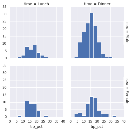
Factor plots
Factor plots can be useful for this kind of visualization as well. This allows you to view the distribution of a parameter within bins defined by any other parameter:
with sns.axes_style(style='ticks'):
    g = sns.catplot("day", "total_bill", "sex", data=tips, kind="box")
    g.set_axis_labels("Day", "Total Bill");
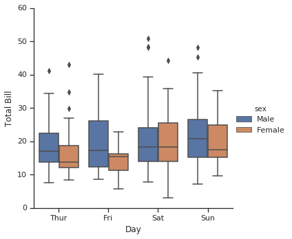
Joint distributions
Similar to the pairplot we saw earlier, we can use sns.jointplot to
show the joint distribution between different datasets, along with the
associated marginal distributions:
with sns.axes_style('white'):
    sns.jointplot("total_bill", "tip", data=tips, kind='hex')
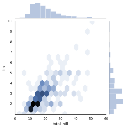
The joint plot can even do some automatic kernel density estimation and regression:
sns.jointplot("total_bill", "tip", data=tips, kind='reg');
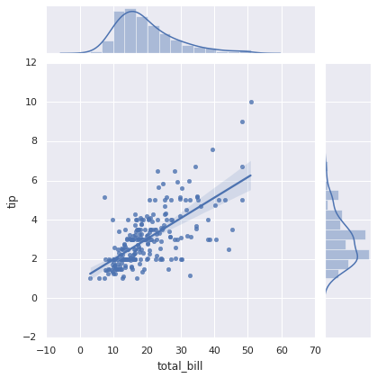
Bar plots
Time series can be plotted using sns.factorplot. In the following
example, we’ll use the Planets data:
planets = sns.load_dataset('planets')
planets.head()
| method | number | orbital_period | mass | distance | year | |
|---|---|---|---|---|---|---|
| 0 | Radial Velocity | 1 | 269.300 | 7.10 | 77.40 | 2006 |
| 1 | Radial Velocity | 1 | 874.774 | 2.21 | 56.95 | 2008 |
| 2 | Radial Velocity | 1 | 763.000 | 2.60 | 19.84 | 2011 |
| 3 | Radial Velocity | 1 | 326.030 | 19.40 | 110.62 | 2007 |
| 4 | Radial Velocity | 1 | 516.220 | 10.50 | 119.47 | 2009 |
with sns.axes_style('white'):
    g = sns.catplot("year", data=planets, aspect=2,
                       kind="count", color='steelblue')
    g.set_xticklabels(step=5)
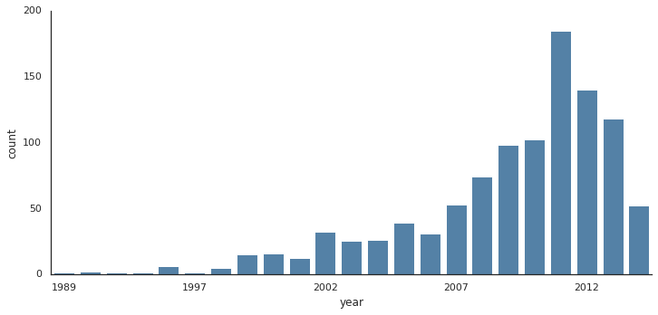
We can learn more by looking at the method of discovery of each of these planets:
with sns.axes_style('white'):
    g = sns.factorplot("year", data=planets, aspect=4.0, kind='count',
                       hue='method', order=range(2001, 2015))
    g.set_ylabels('Number of Planets Discovered')

Example: Exploring Marathon Finishing Times
Here we’ll look at using Seaborn to help visualize and understand finishing results from a marathon. I’ve scraped the data from sources on the Web, aggregated it and removed any identifying information, and put it on GitHub where it can be downloaded (if you are interested in using Python for web scraping, I would recommend Web Scraping with Python by Ryan Mitchell). We will start by downloading the data from the Web, and loading it into Pandas:
!curl -O https://raw.githubusercontent.com/jakevdp/marathon-data/master/marathon-data.csv
  % Total    % Received % Xferd  Average Speed   Time    Time     Time  Current
                                 Dload  Upload   Total   Spent    Left  Speed
100  836k  100  836k    0     0   974k      0 --:--:-- --:--:-- --:--:--  972k
data = pd.read_csv('marathon-data.csv')
data.head()
| age | gender | split | final | |
|---|---|---|---|---|
| 0 | 33 | M | 01:05:38 | 02:08:51 |
| 1 | 32 | M | 01:06:26 | 02:09:28 |
| 2 | 31 | M | 01:06:49 | 02:10:42 |
| 3 | 38 | M | 01:06:16 | 02:13:45 |
| 4 | 31 | M | 01:06:32 | 02:13:59 |
By default, Pandas loaded the time columns as Python strings (type
object); we can see this by looking at the dtypes attribute of
the DataFrame:
data.dtypes
age        int64
gender    object
split     object
final     object
dtype: object
Let’s fix this by providing a converter for the times:
import datetime

def convert_time(s):
    h, m, s = map(int, s.split(':'))
    return datetime.timedelta(hours=h, minutes=m, seconds=s)

data = pd.read_csv('marathon-data.csv',
                   converters={'split':convert_time, 'final':convert_time})
data.head()
| age | gender | split | final | |
|---|---|---|---|---|
| 0 | 33 | M | 01:05:38 | 02:08:51 |
| 1 | 32 | M | 01:06:26 | 02:09:28 |
| 2 | 31 | M | 01:06:49 | 02:10:42 |
| 3 | 38 | M | 01:06:16 | 02:13:45 |
| 4 | 31 | M | 01:06:32 | 02:13:59 |
data.dtypes
age                 int64
gender             object
split     timedelta64[ns]
final     timedelta64[ns]
dtype: object
That looks much better. For the purpose of our Seaborn plotting utilities, let’s next add columns that give the times in seconds:
data['split_sec'] = data['split'].astype(int) / 1E9
data['final_sec'] = data['final'].astype(int) / 1E9
data.head()
| age | gender | split | final | split_sec | final_sec | |
|---|---|---|---|---|---|---|
| 0 | 33 | M | 01:05:38 | 02:08:51 | 3938.0 | 7731.0 |
| 1 | 32 | M | 01:06:26 | 02:09:28 | 3986.0 | 7768.0 |
| 2 | 31 | M | 01:06:49 | 02:10:42 | 4009.0 | 7842.0 |
| 3 | 38 | M | 01:06:16 | 02:13:45 | 3976.0 | 8025.0 |
| 4 | 31 | M | 01:06:32 | 02:13:59 | 3992.0 | 8039.0 |
To get an idea of what the data looks like, we can plot a jointplot
over the data:
with sns.axes_style('white'):
    g = sns.jointplot("split_sec", "final_sec", data, kind='hex')
    g.ax_joint.plot(np.linspace(4000, 16000),
                    np.linspace(8000, 32000), ':k')
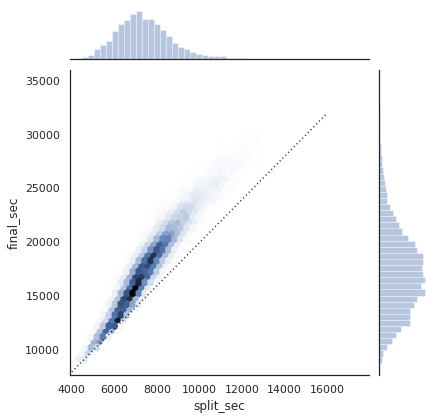
The dotted line shows where someone’s time would lie if they ran the marathon at a perfectly steady pace. The fact that the distribution lies above this indicates (as you might expect) that most people slow down over the course of the marathon. If you have run competitively, you’ll know that those who do the opposite—run faster during the second half of the race—are said to have “negative-split” the race.
Let’s create another column in the data, the split fraction, which measures the degree to which each runner negative-splits or positive-splits the race:
data['split_frac'] = 1 - 2 * data['split_sec'] / data['final_sec']
data.head()
| age | gender | split | final | split_sec | final_sec | split_frac | |
|---|---|---|---|---|---|---|---|
| 0 | 33 | M | 01:05:38 | 02:08:51 | 3938.0 | 7731.0 | -0.018756 |
| 1 | 32 | M | 01:06:26 | 02:09:28 | 3986.0 | 7768.0 | -0.026262 |
| 2 | 31 | M | 01:06:49 | 02:10:42 | 4009.0 | 7842.0 | -0.022443 |
| 3 | 38 | M | 01:06:16 | 02:13:45 | 3976.0 | 8025.0 | 0.009097 |
| 4 | 31 | M | 01:06:32 | 02:13:59 | 3992.0 | 8039.0 | 0.006842 |
Where this split difference is less than zero, the person negative-split the race by that fraction. Let’s do a distribution plot of this split fraction:
sns.distplot(data['split_frac'], kde=False);
plt.axvline(0, color="k", linestyle="--");
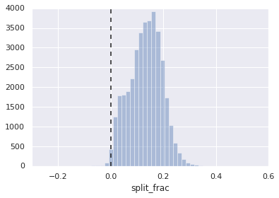
sum(data.split_frac < 0)
251
Out of nearly 40,000 participants, there were only 250 people who negative-split their marathon.
Let’s see whether there is any correlation between this split fraction
and other variables. We’ll do this using a pairgrid, which draws
plots of all these correlations:
g = sns.PairGrid(data, vars=['age', 'split_sec', 'final_sec', 'split_frac'],
                 hue='gender', palette='RdBu_r')
g.map(plt.scatter, alpha=0.8)
g.add_legend();
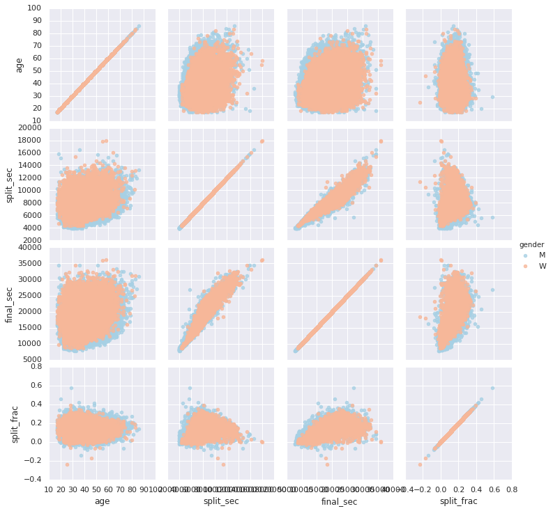
It looks like the split fraction does not correlate particularly with age, but does correlate with the final time: faster runners tend to have closer to even splits on their marathon time. (We see here that Seaborn is no panacea for Matplotlib’s ills when it comes to plot styles: in particular, the x-axis labels overlap. Because the output is a simple Matplotlib plot, however, the methods about ticks can be used to adjust such things if desired.)
The difference between men and women here is interesting. Let’s look at the histogram of split fractions for these two groups:
sns.kdeplot(data.split_frac[data.gender=='M'], label='men', shade=True)
sns.kdeplot(data.split_frac[data.gender=='W'], label='women', shade=True)
plt.xlabel('split_frac');
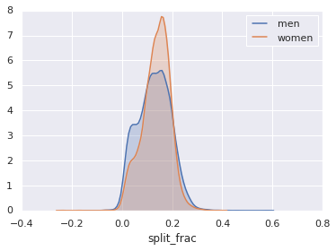
The interesting thing here is that there are many more men than women who are running close to an even split! This almost looks like some kind of bimodal distribution among the men and women. Let’s see if we can suss-out what’s going on by looking at the distributions as a function of age.
A nice way to compare distributions is to use a violin plot
sns.violinplot("gender", "split_frac", data=data, palette=["lightblue", "lightpink"]);
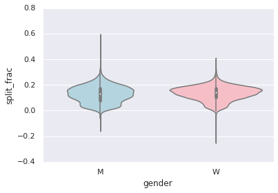
This is yet another way to compare the distributions between men and women.
Let’s look a little deeper, and compare these violin plots as a function of age. We’ll start by creating a new column in the array that specifies the decade of age that each person is in:
data['age_dec'] = data.age.map(lambda age: 10 * (age // 10))
data.head()
| age | gender | split | final | split_sec | final_sec | split_frac | age_dec | |
|---|---|---|---|---|---|---|---|---|
| 0 | 33 | M | 01:05:38 | 02:08:51 | 3938.0 | 7731.0 | -0.018756 | 30 |
| 1 | 32 | M | 01:06:26 | 02:09:28 | 3986.0 | 7768.0 | -0.026262 | 30 |
| 2 | 31 | M | 01:06:49 | 02:10:42 | 4009.0 | 7842.0 | -0.022443 | 30 |
| 3 | 38 | M | 01:06:16 | 02:13:45 | 3976.0 | 8025.0 | 0.009097 | 30 |
| 4 | 31 | M | 01:06:32 | 02:13:59 | 3992.0 | 8039.0 | 0.006842 | 30 |
men = (data.gender == 'M')
women = (data.gender == 'W')

with sns.axes_style(style=None):
    sns.violinplot("age_dec", "split_frac", hue="gender", data=data,
                   split=True, inner="quartile",
                   palette=["lightblue", "lightpink"]);
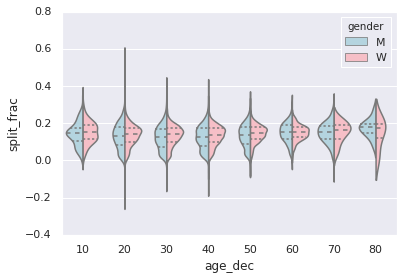
Looking at this, we can see where the distributions of men and women differ: the split distributions of men in their 20s to 50s show a pronounced over-density toward lower splits when compared to women of the same age (or of any age, for that matter).
Also surprisingly, the 80-year-old women seem to outperform everyone in terms of their split time. This is probably due to the fact that we’re estimating the distribution from small numbers, as there are only a handful of runners in that range:
(data.age > 80).sum()
7
Back to the men with negative splits: who are these runners? Does this
split fraction correlate with finishing quickly? We can plot this very
easily. We’ll use regplot, which will automatically fit a linear
regression to the data:
g = sns.lmplot('final_sec', 'split_frac', col='gender', data=data,
               markers=".", scatter_kws=dict(color='c'))
g.map(plt.axhline, y=0.1, color="k", ls=":");
