The Design of Tufte’s Books
The pages of a book are usually divided into three major sections: the front matter (also called preliminary matter or prelim), the main matter (the core text of the book), and the back matter (or end matter).
The front matter of a book refers to all of the material that comes before the main text. The following table shows a list of material that appears in the front matter of The Visual Display of Quantitative Information, Envisioning Information, Visual Explanations, and Beautiful Evidence along with its page number. Page numbers that appear in parentheses refer to folios that do not have a printed page number (but they are still counted in the page number sequence).
| Page content | VDQI | EI | VE | BE |
|---|---|---|---|---|
| Blank half title page | (1) | (1) | (1) | (1) |
| Frontispiece | (2) | (2) | (2) | (2) |
| Full title page | (3) | (3) | (3) | (3) |
| Copyright page | (4) | (4) | (4) | (4) |
| Contents | (5) | (5) | (5) | (5) |
| Dedication | (6) | (7) | (7) | 7 |
| Epigraph | – | – | (8) | – |
| Introduction | (7) | (9) | (9) | 9 |
The contents of this page vary from book to book. In VDQI this page is blank; in EI and VE this page holds a frontispiece; and in BE this page contains three epigraphs.
The design of the front matter in Tufte’s books varies slightly from the traditional design of front matter. First, the pages in front matter are traditionally numbered with lowercase roman numerals (e.g., i, ii, iii, iv, …). Second, the front matter page numbering sequence is usually separate from the main matter page numbering. That is, the page numbers restart at 1 when the main matter begins. In contrast, Tufte has enumerated his pages with arabic numerals that share the same page counting sequence as the main matter.
There are also some variations in design across Tufte’s four books. The page opposite the full title page (labeled “frontispiece” in the above table) has different content in each of the books. In The Visual Display of Quantitative Information, this page is blank; in Envisioning Information and Visual Explanations, this page holds a frontispiece; and in Beautiful Evidence, this page contains three epigraphs.
The dedication appears on page 6 in VDQI (opposite the introduction), and is placed on its own spread in the other books. In VE, an epigraph shares the spread with the opening page of the introduction.
None of the page numbers (folios) of the front matter are expressed except in BE, where the folios start to appear on the dedication page.
The full title page of each of the books varies slightly in design. In all the books, the author’s name appears at the top of the page, the title is set just above the center line, and the publisher is printed along the bottom margin. Some of the differences are outlined in the following table.
| Feature | VDQI | EI | VE | BE |
|---|---|---|---|---|
| Author | ||||
| Typeface | serif | serif | serif | sans serif |
| Style | italics | italics | italics | upright, caps |
| Size | 24 pt | 20 pt | 20 pt | 20 pt |
| Title | ||||
| Typeface | serif | serif | serif | sans serif |
| Style | upright | italics | upright | upright, caps |
| Size | 36 pt | 48 pt | 48 pt | 36 pt |
| Subtitle | ||||
| Typeface | – | – | serif | – |
| Style | – | – | upright | – |
| Size | – | – | 20 pt | – |
| Edition | ||||
| Typeface | sans serif | – | – | – |
| Style | upright, caps | – | – | – |
| Size | 14 pt | – | – | – |
| Publisher | ||||
| Typeface | serif | serif | serif | sans serif |
| Style | italics | italics | italics | upright, caps |
| Size | 14 pt | 14 pt | 14 pt | 14 pt |
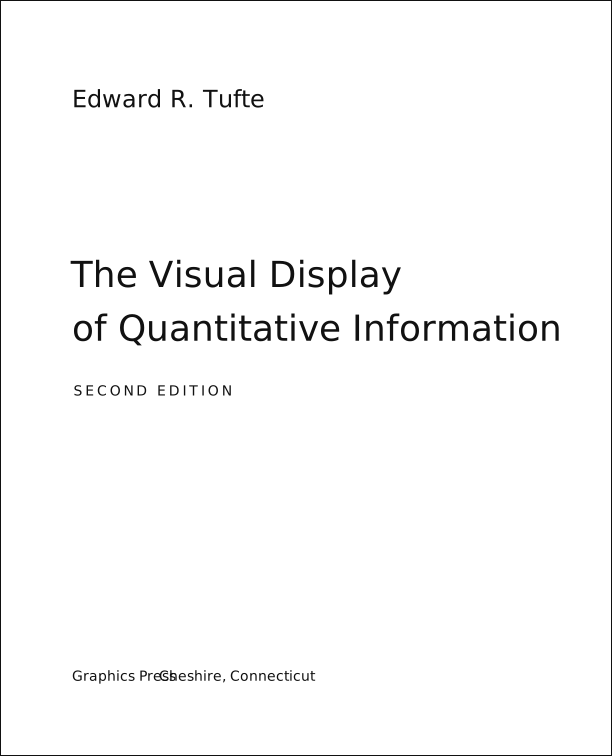
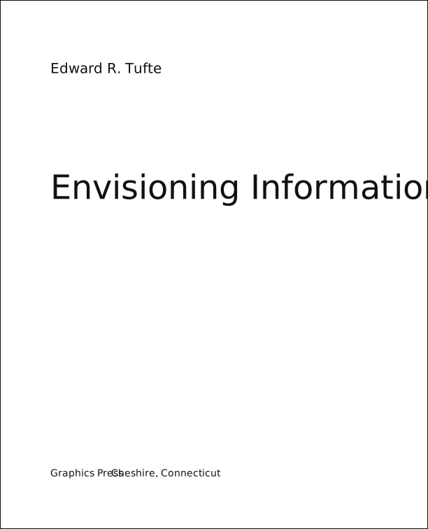
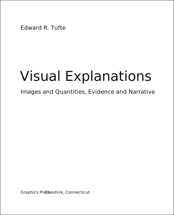
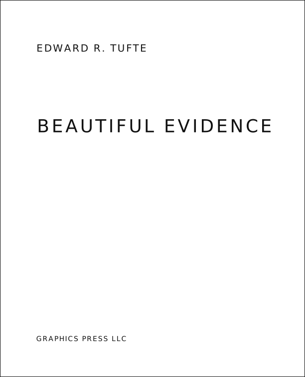
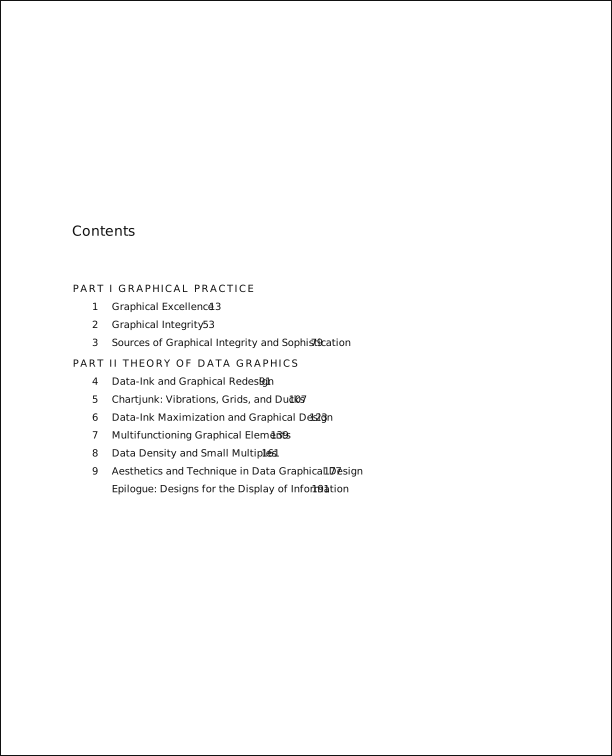
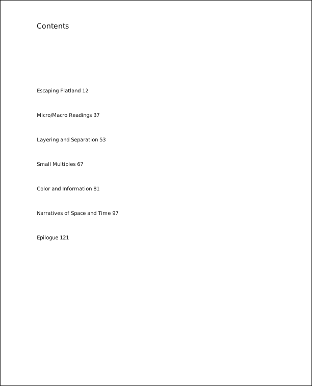
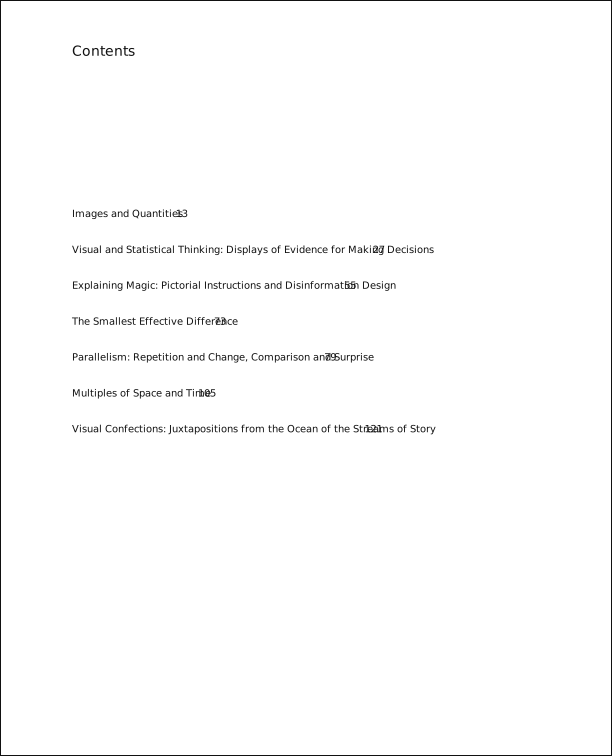
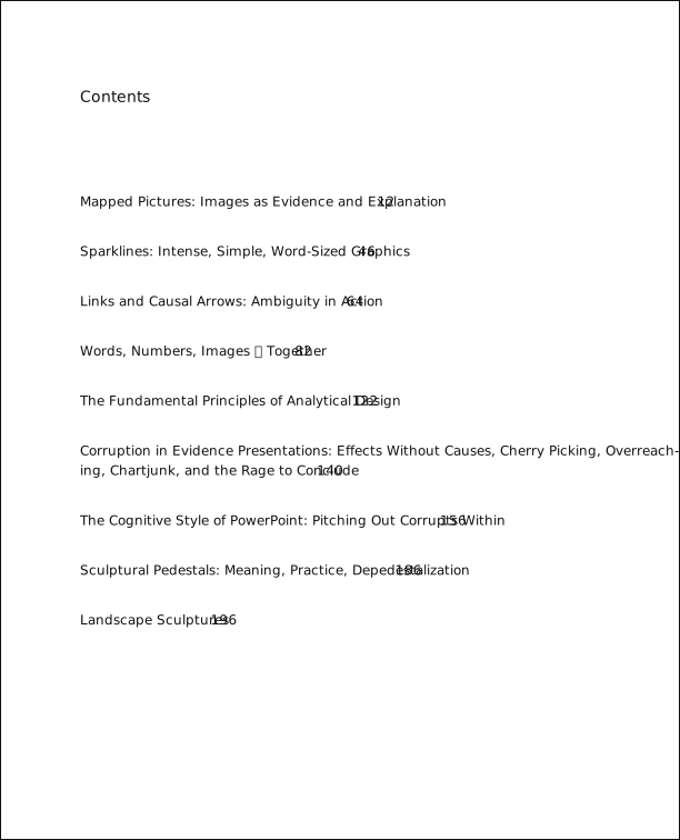
The tables of contents in Tufte’s books give us our first
glimpse of the structure of the main matter. The Visual Display of Quantitative Information is split into two
parts, each containing some number of chapters. His other three books only
contain chapters—they’re not broken into parts.The title and contents pages above and below were converted from the vector PDFs shipped with Tufte-LaTeX (graphics/*-title.pdf, graphics/*-contents.pdf) to SVG, keeping the position, size and style of every line of text.
Typefaces#
Tufte’s books primarily use two typefaces: Bembo and Gill Sans. Bembo is used for the headings and body text, while Gill Sans is used for the title page and opening epigraphs in Beautiful Evidence.
Since neither Bembo nor Gill Sans are available in default LaTeX
installations, the Tufte-LaTeX document classes default to using Palatino and
Helvetica, respectively. In addition, the Bera Mono typeface is used for
monospaced type. On the web, this theme uses ET Book, a Bembo-like face
designed for Tufte’s books, with Gill Sans for the sans-serif.
The following font sizes are defined by the Tufte-LaTeX classes:
| LaTeX size | Font size | Leading | Used for |
|---|---|---|---|
\tiny | 5 | 6 | sidenote numbers |
\scriptsize | 7 | 8 | – |
\footnotesize | 8 | 10 | sidenotes, captions |
\small | 9 | 12 | quote, quotation, and verse environments |
\normalsize | 10 | 14 | body text |
\large | 11 | 15 | b-heads |
\Large | 12 | 16 | a-heads, toc entries, author, date |
\LARGE | 14 | 18 | handout title |
\huge | 20 | 30 | chapter heads |
\Huge | 24 | 36 | part titles |
Headings#
Tufte’s books include the following heading levels: parts,
chapters,Parts and chapters are defined for the tufte-book class only. sections, subsections, and paragraphs. Not defined by default
are: sub-subsections and subparagraphs.
| Heading | Style | Size |
|---|---|---|
| Part | roman | 24/36×40 pc |
| Chapter | italic | 20/30×40 pc |
| Section | italic | 12/16×26 pc |
| Subsection | italic | 11/15×26 pc |
| Paragraph | italic | 10/14 |
Paragraph#
Paragraph headings (as shown here) are introduced by italicized text and separated from the main paragraph by a bit of space.
Environments#
The following characteristics define the various environments:
| Environment | Font size | Notes |
|---|---|---|
| Body text | 10/14×26 pc | |
| Block quote | 9/12×24 pc | Block indent (left and right) by 1 pc |
| Sidenotes | 8/10×12 pc | Sidenote number is set inline, followed by word space |
| Captions | 8/10×12 pc |